The Product
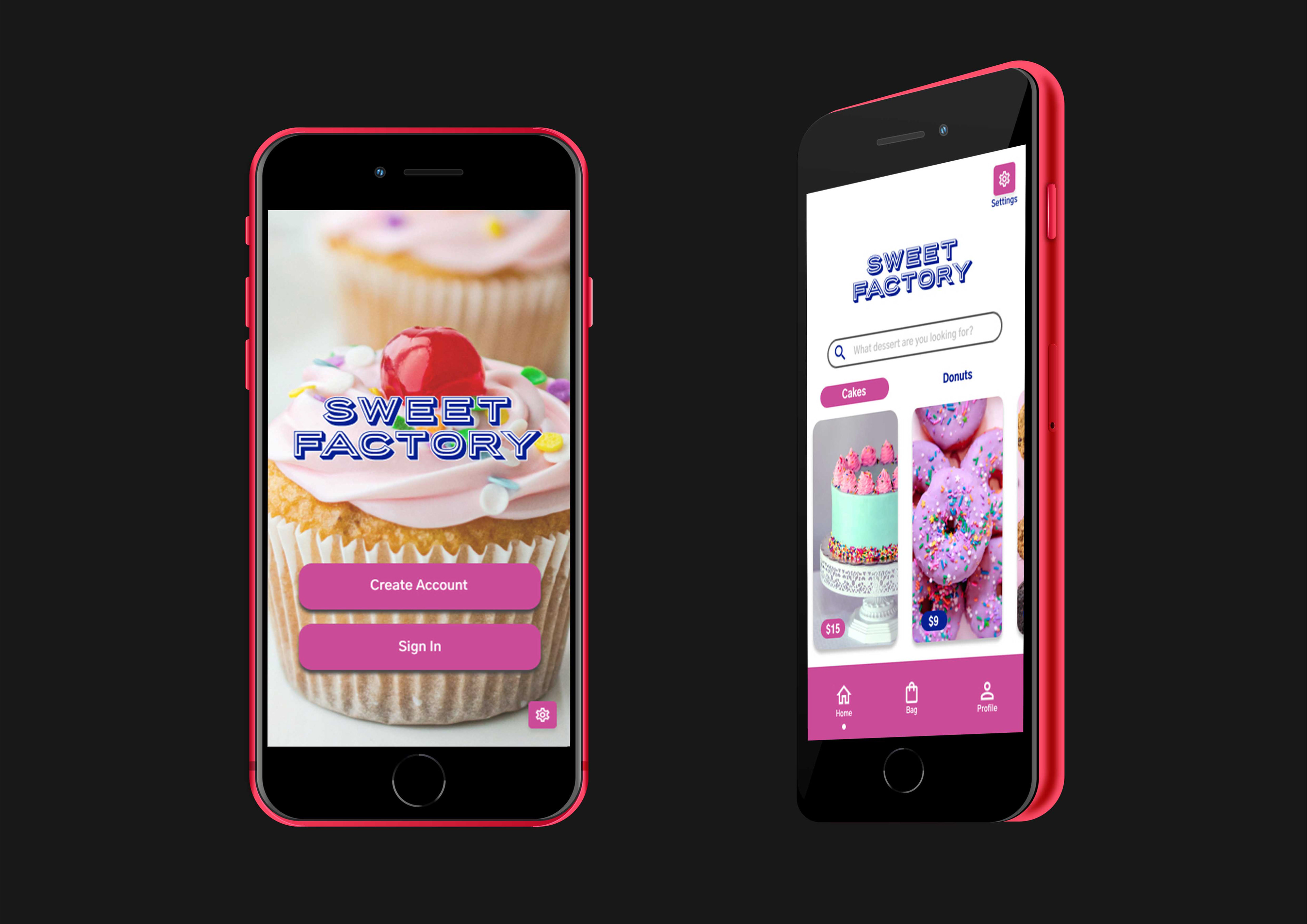
Sweet Factory is a food customization app with an emphasis on bakery items. The design concept originates from the idea of being able to build your sweets they way you want to, which is the reason why "factory" was placed in the app's name. The app's color choices of pink and blue were chosen to emphasize sweetness and reliability.
The Problem
Users want to have access to a custom dessert without the inconvenience of picking it up or spending too much money
The Goal
Create a food customization app that allows users to create their favorite desserts, while giving them an option to save money and have their order delivered.
My Role
Lead UX designer, Lead UX researcher, Lead UI designer
Responsibilities
User Research, Wireframing, Low Fidelity and High Fidelity Prototyping, and Accounting for Accessibility.
Understanding the User
User Research Summary
The research that I conducted was for a food order customization app. I held in person interviews with five participants. Before the interviews were held, I predicted that most of the participants would feel the same about layout and physical design. My assumptions changed when only one of the participants mentioned anything about aesthetics. Most participants shared the same opinion about how they felt when they got to the checkout portion of the food app.
User Research Pain Points
1. Lack of Options
Not having enough options forces the user to leave the app to look for what they desire. This tip will guide the layout design for the app.
2. Hidden Fees
Not being upfront about prices causes frustration for the user. This tip is helpful for setting an open and honest tone when it is time to put in text.
3. No Customer Appreciation
Not rewarding the customer will encourage them to leave. This tip will help guide the design of a rewards program within the app.
4. Not User Friendly
Having a complex layout and forgetting to add simple yet necessary functions will confuse the user. This tip will be useful for layout design and aesthetics.
Persona
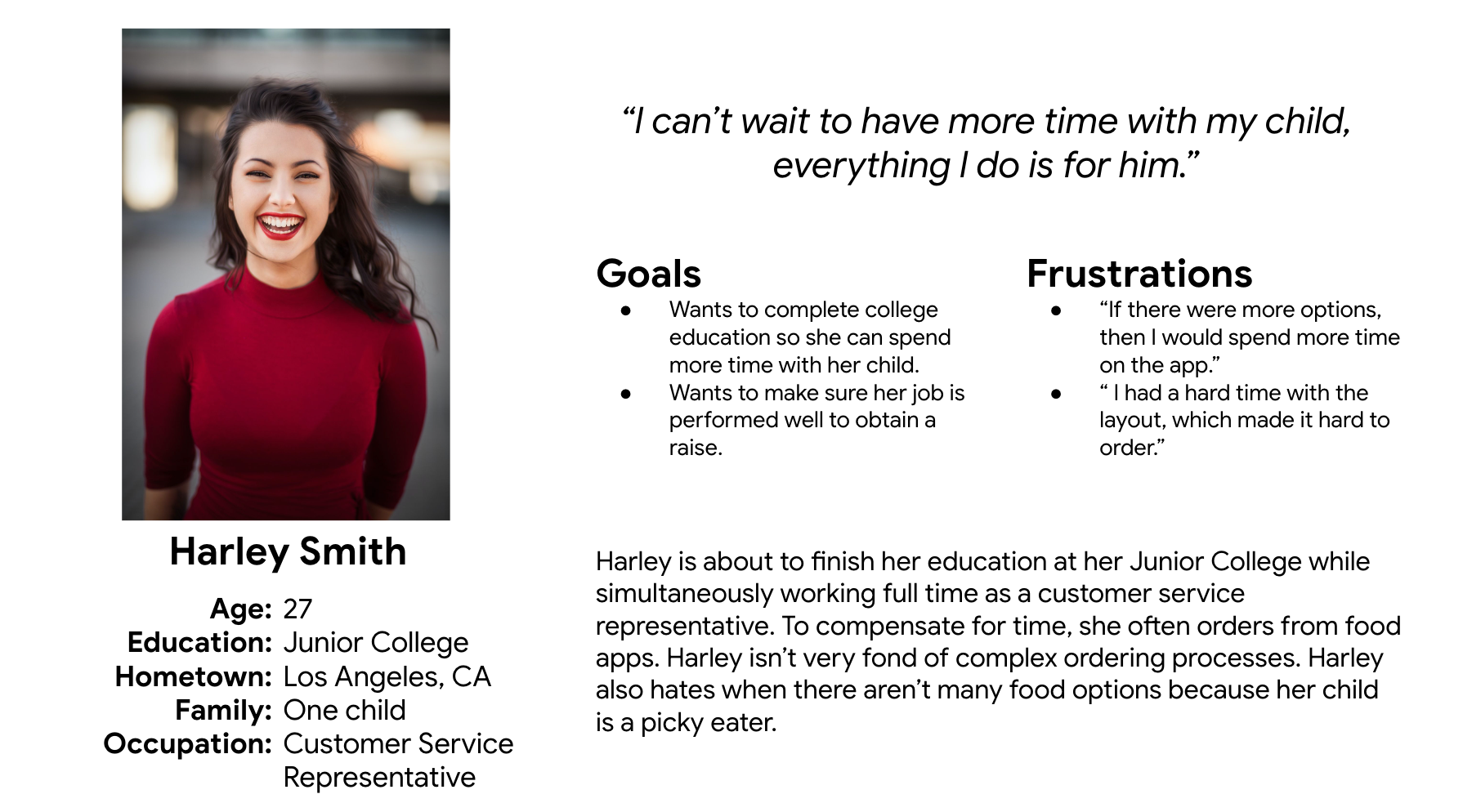
Problem statement: Harley is a working single mother and college student who needs convenience and more in app options because she does not have time to cook and her son is a picky eater.
User Journey Map
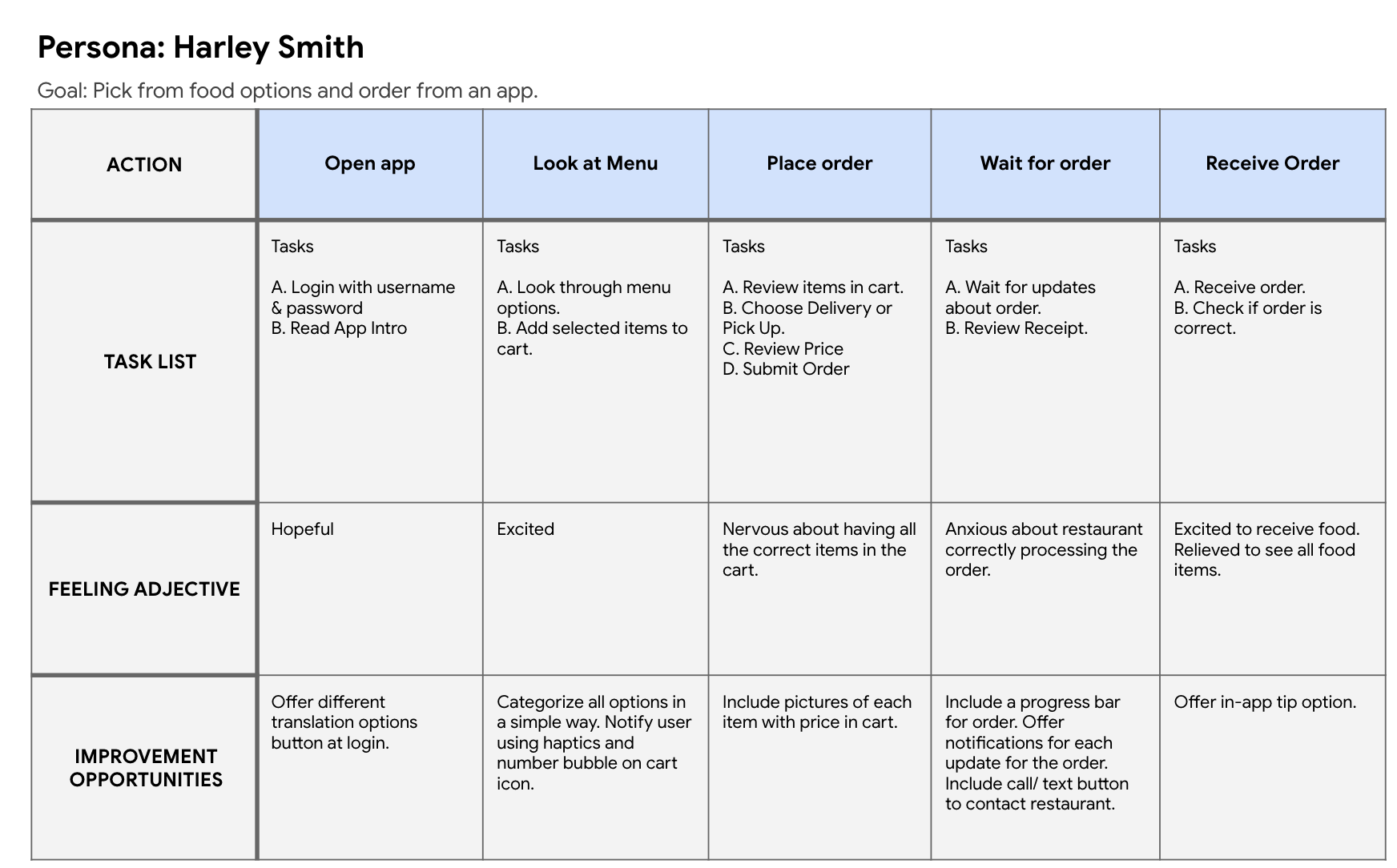
When mapping out Harley’s user journey, it became more clear on what can be included in the app. It also was much simpler to identify where accessibility options could be inserted.
Starting the Design
Paper Wireframes

To begin, I created different variations of all the pages in order to select the features that fit best with the user's needs and the app's goals. I went through each variation and created a final version with all of the updated features.
Digital Wireframes
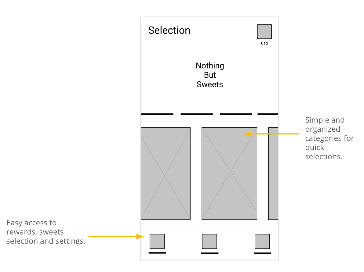
My goals included making the app design simple and provide user friendly features. A straightforward layout and quick access to features like the rewards tab and settings tab was a high priority.
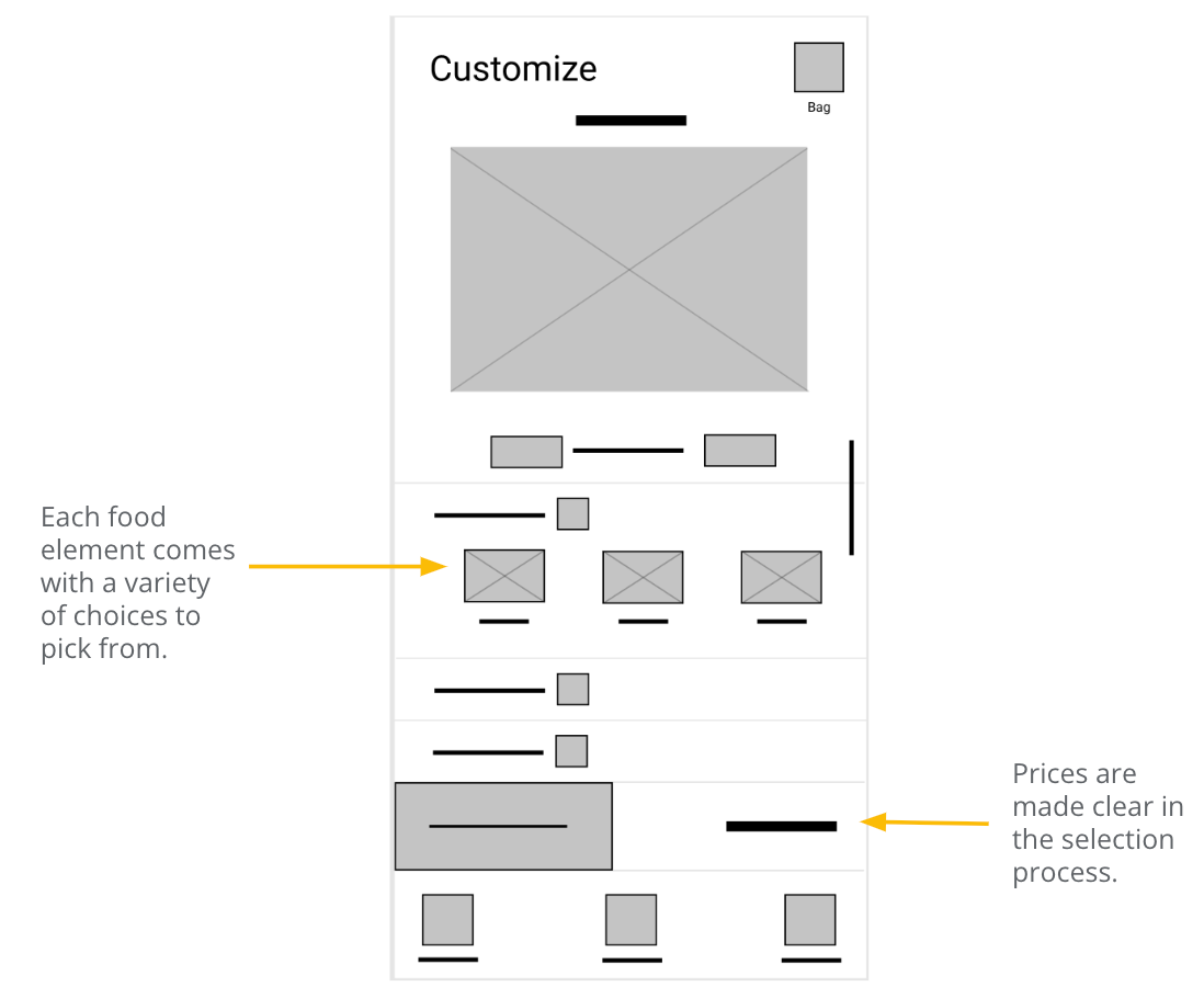
Based on user research, users valued variety and no hidden fees. I made sure to include multiple design options and made the total visible before it is added to the bag.
Low-Fidelity Prototype
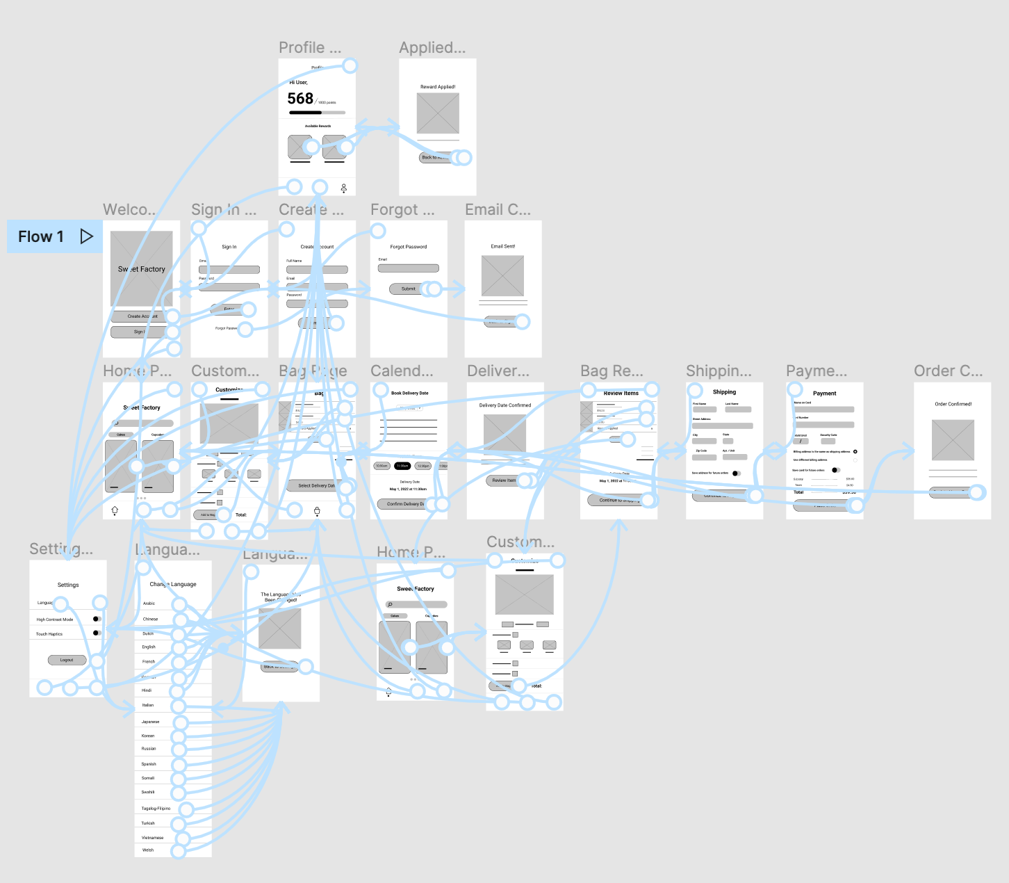
To show the user flow for the Sweet Factory app, the wireframes have been made into a low-fidelity prototype in Figma.
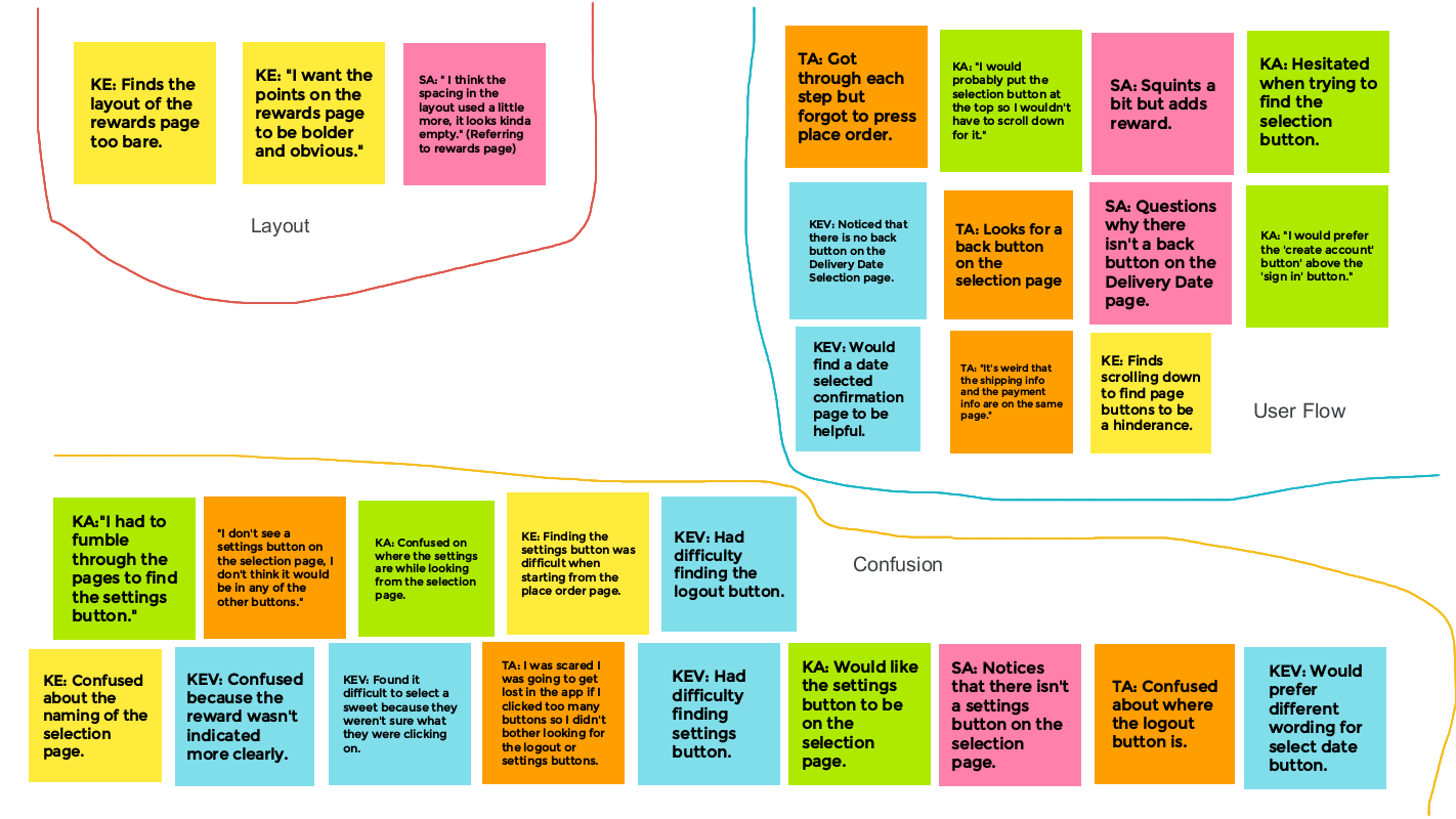
Analyzing user responses of the low-fidelity prototype.
Mockups
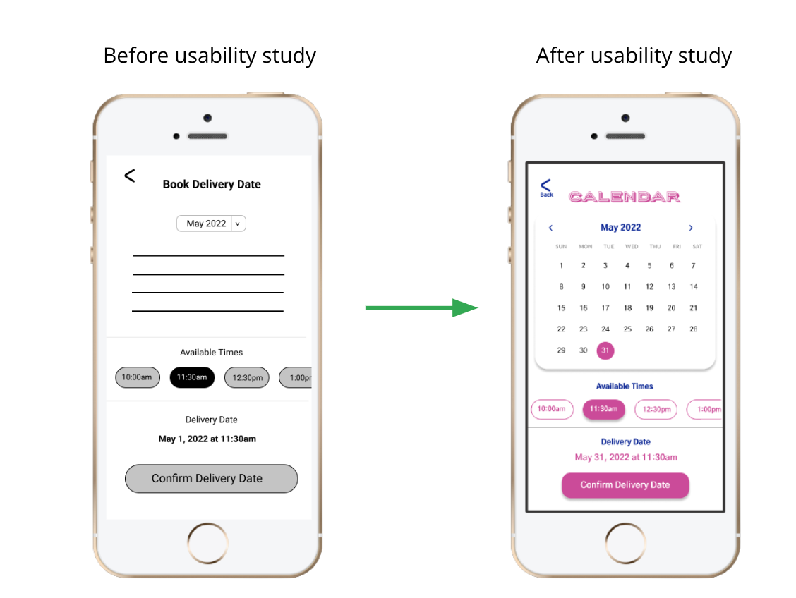
The previous design had a drop down month bar but after the usability study, I thought it would be better to just add arrows to flip between each month so that the drop down menu doesn’t get in the way. A title change for this page was added to create less confusion.
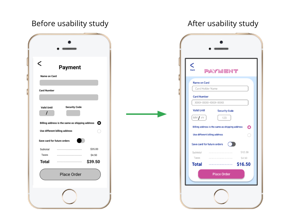
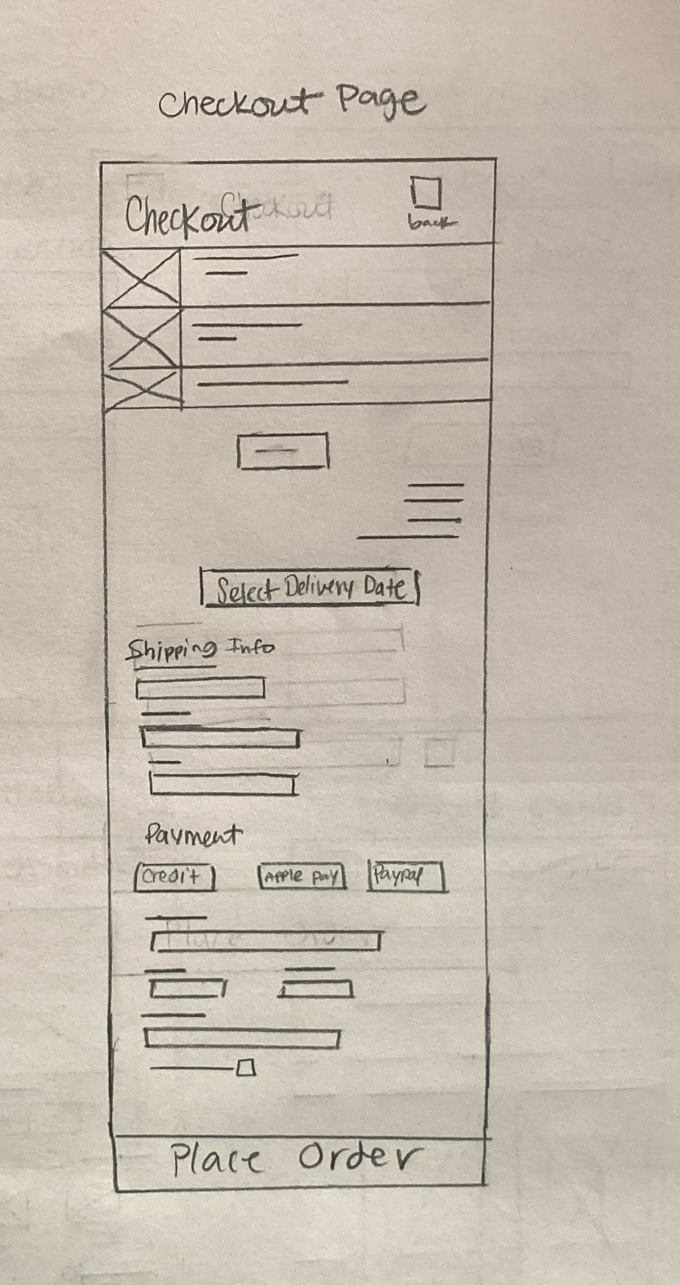
The previous design relied on the user to know what each function was. Instead of assuming the user’s knowledge, in the updated design, the back button is clearly labeled and the text fields provide examples for how to fill out each section.
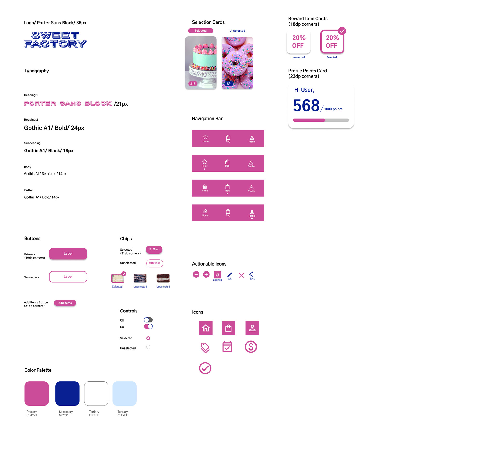
High-Fidelity Mockups
Sticker Sheet
High-Fidelity Prototype
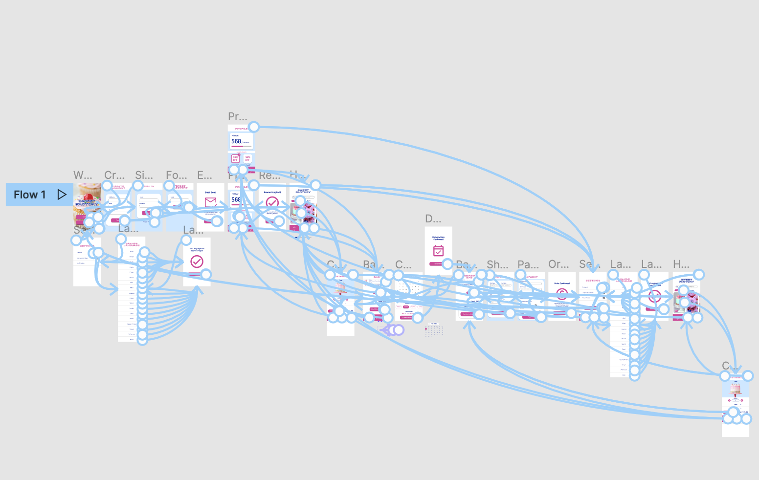
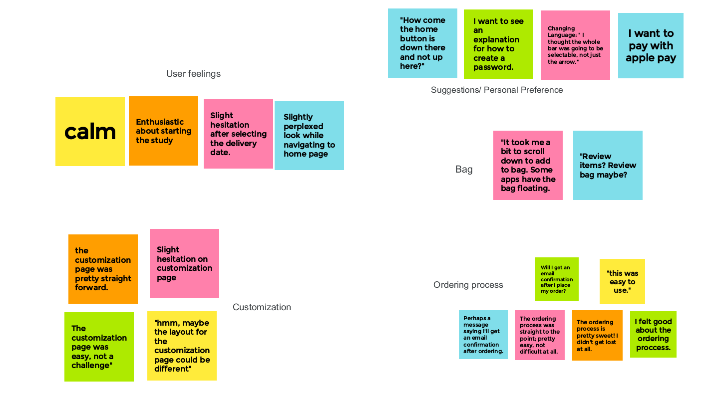
After analyzing user responses to the high-fidelity prototype, I made improvements to solidify the app design.
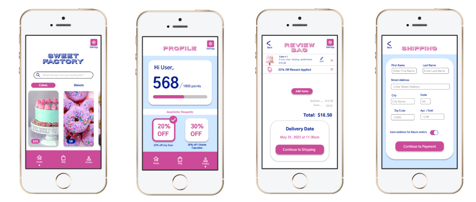
Final High-Fidelity Prototype
Accessibility Considerations
1. Within the settings, a touch haptics mode can be enabled with the flip of a switch.
2. Within the settings, a high contrast mode can be enabled with the flip of a switch
3. Within the settings, a user can change the language.
Going Forward
Takeaways
Impact
User’s found the ordering process through the app to be simple after the last research study was completed. “The app is pretty sweet! I didn’t get lost while using it.” - User D
What I Learned
It’s important to have others review your work because there may be something that you did not notice before. Making changes throughout the project is crucial to meeting deadlines instead of waiting until the very end to modify everything.
Let's Connect!
Thank you!