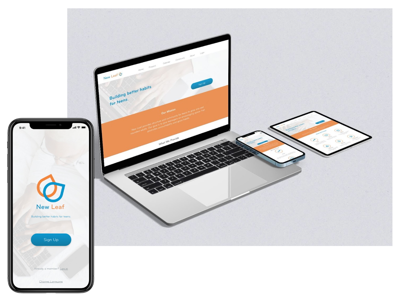
The Product
New Leaf is an app designed for social good. This app benefits teenagers by giving them the option to build better habits through community, daily plans, calendars and task lists.
The Problem
Many habit themed apps are confusing, overwhelming and do not provide a focus for the user.
The Goal
To promote positive change in the society, the goal is to keep users engaged with the app so they become consistent when learning how to build better habits.
My Role
Lead UX Designer, Lead UX Researcher, Lead UI Designer
Responsibilities
User Research, Wireframing, Low fidelity and High fidelity Prototyping, Accounting for Accessibility
Understanding the User
User Research: Summary
To begin my research, I sent surveys to my target audience which were teenagers and a couple of parents of teenagers to get a better idea of what users might need. I assumed that everyone would suggest having some sort of planner or organizer for the app and my assumptions were correct after receiving the feedback. Most users have never used a habit tracking app which surprised me. I found it useful to know that most users also thought of using this app on the go.
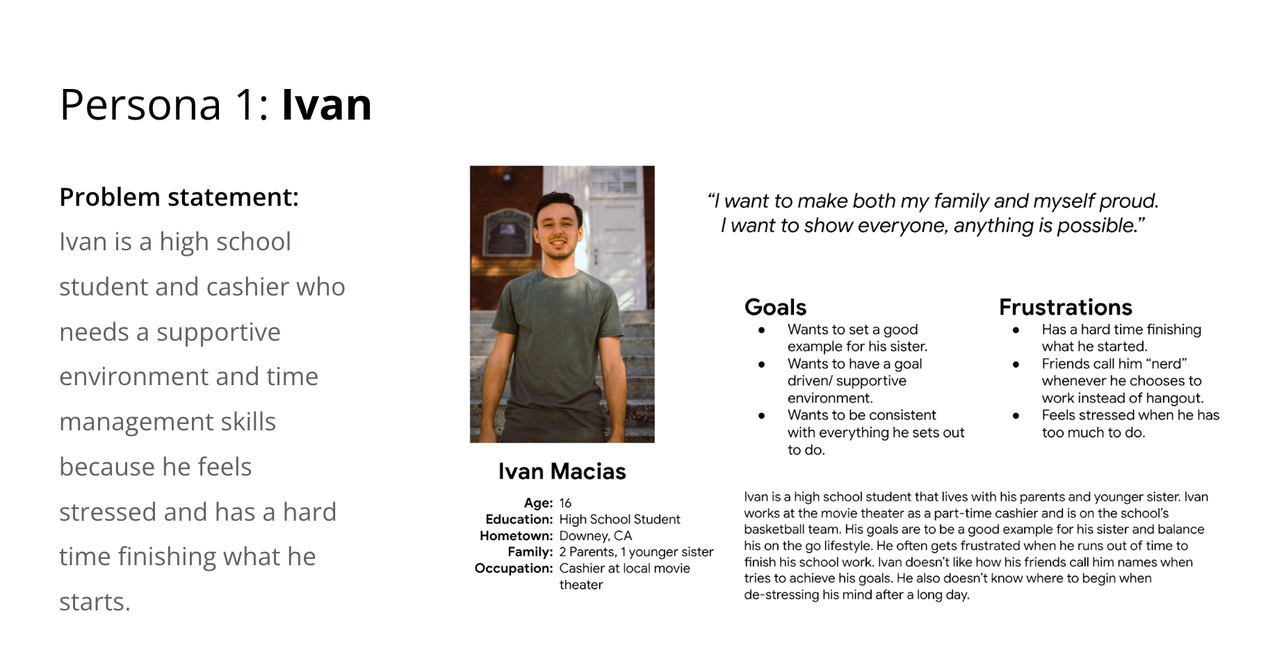
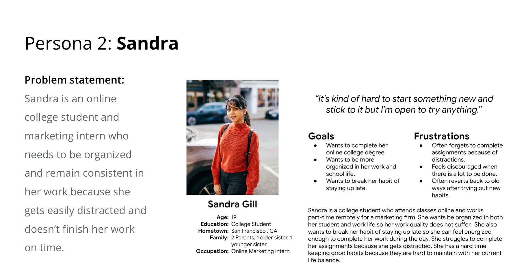
Personas
Competitive Audit
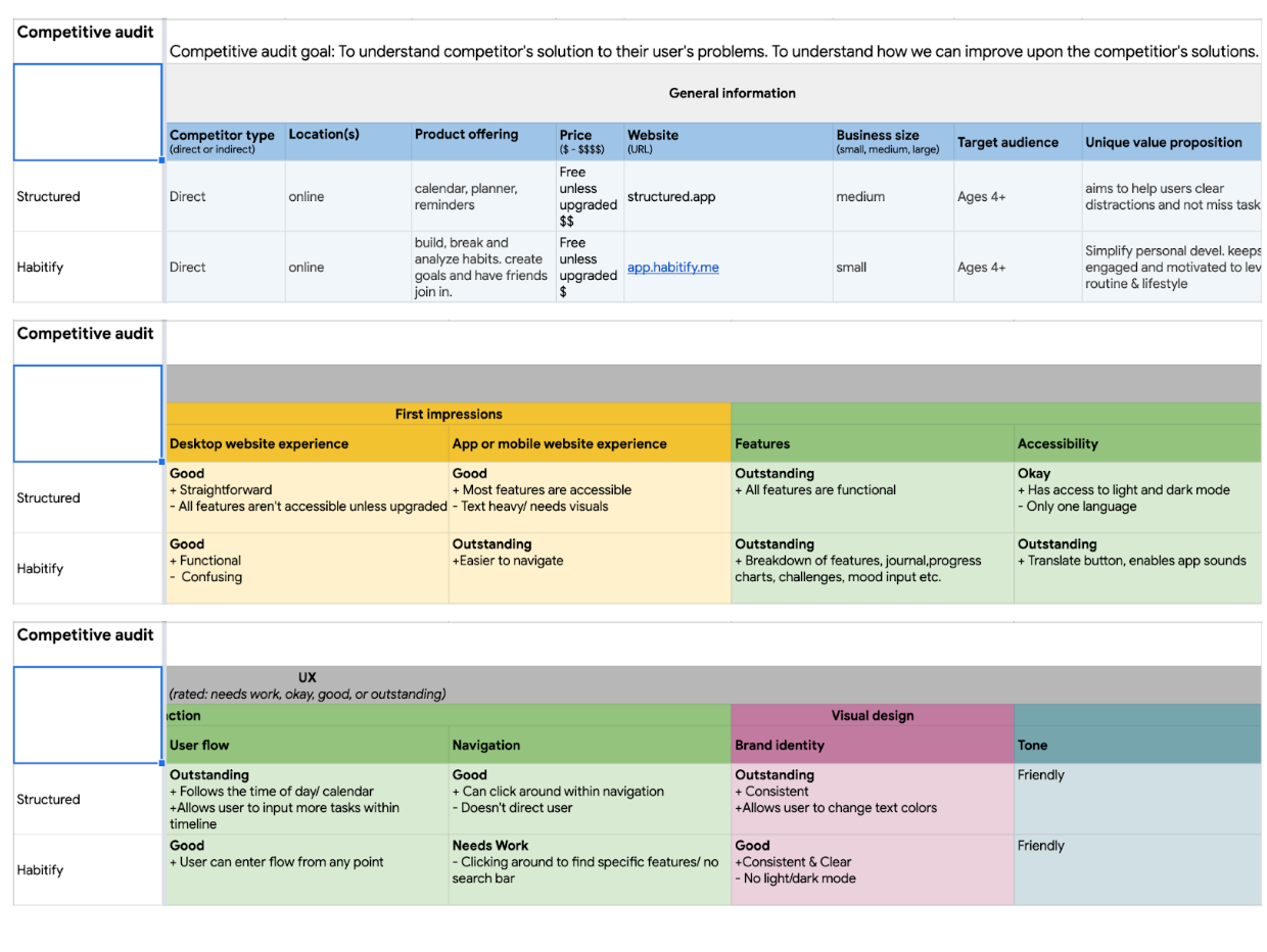
I looked into other habit tracking apps to understand how they were solving their audiences problems. Users may have been led to use these apps because they both include calendars and some type of planner. However, to access all of the features, users have to pay.
Ideation
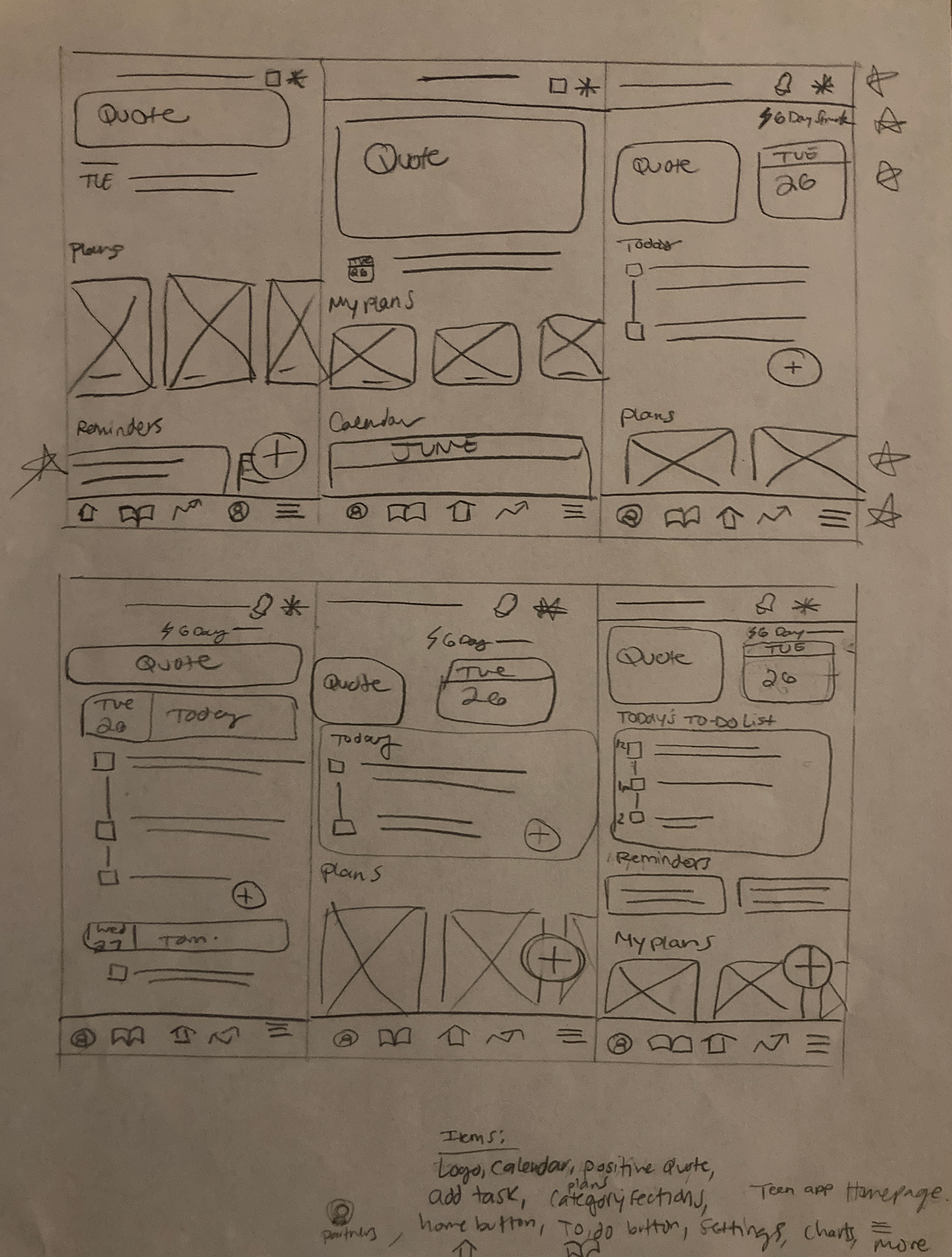
I started creating wireframes for the app’s homepage. I focused on including all necessary tools to keep a student organized like a calendar, task list, plans section and an inspirational quotes section.
Starting the Digital Design
Digital Wireframes
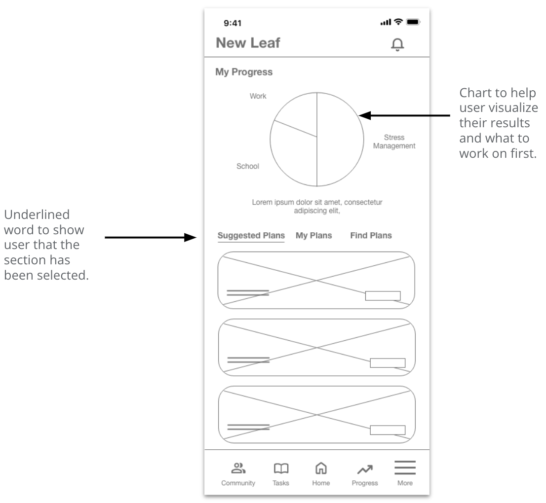
I wanted to create a page that gives a clear visual on where the user stands in the areas that they need the most work in. A suggestion I received was to make the word tabs highlighted instead of underlined so that users can see the difference when clicking through tabs.
Low Fidelity Prototypes
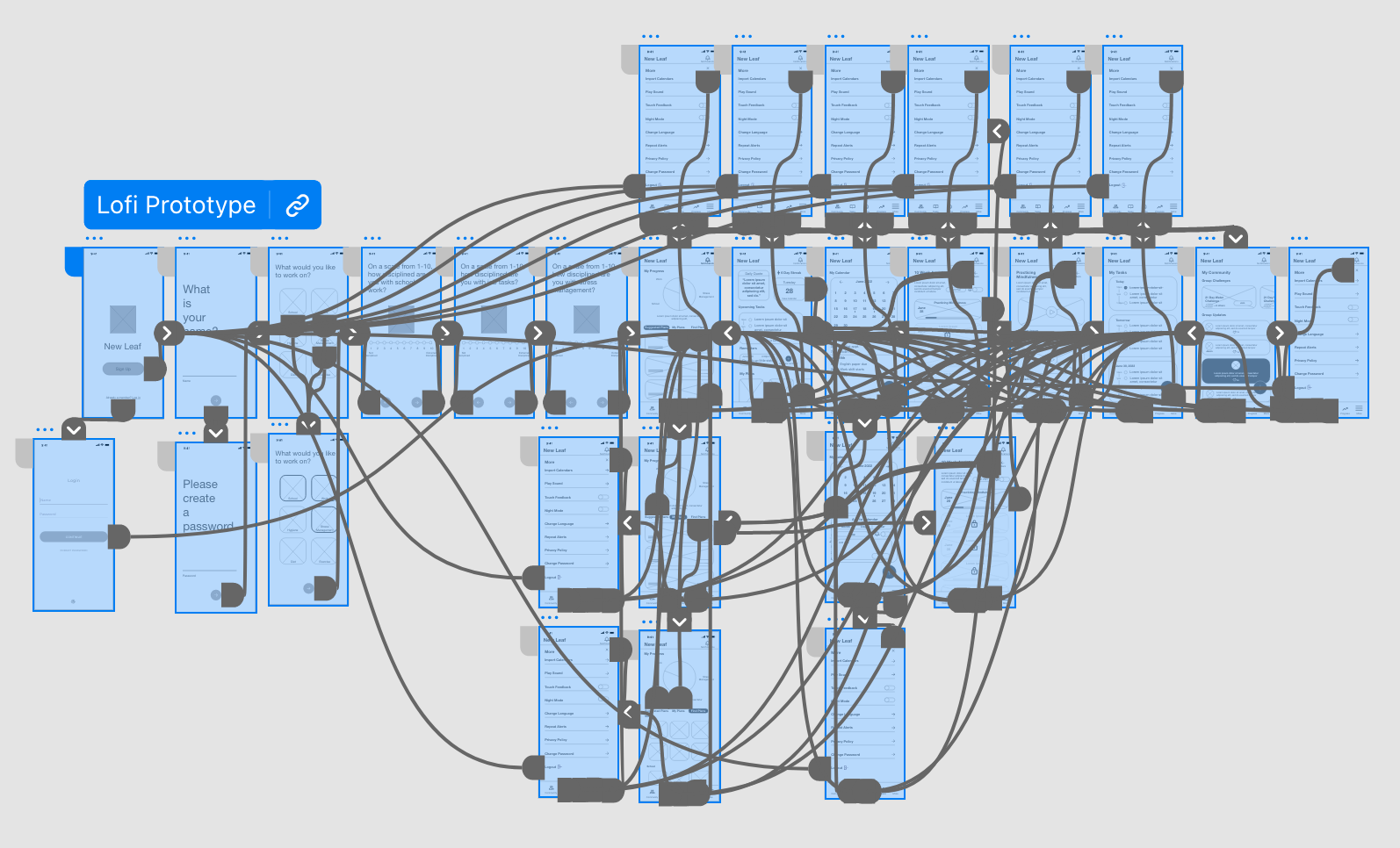
To conduct usability studies, I created a low fidelity prototype of the dedicated mobile app.
Usability Study Parameters
Study type:
Moderated usability study
Location:
California, USA
Participants:
5 participants
Length:
30 minutes
Usability Study Findings
1. Notification symbol needed to be labeled.
2. ⅘ participants felt confident when navigating through the app.
3. ⅘ Participants found the layout confusing when they saw no change when pressing different tab buttons on the progress page.
Refining the Design
Mockups
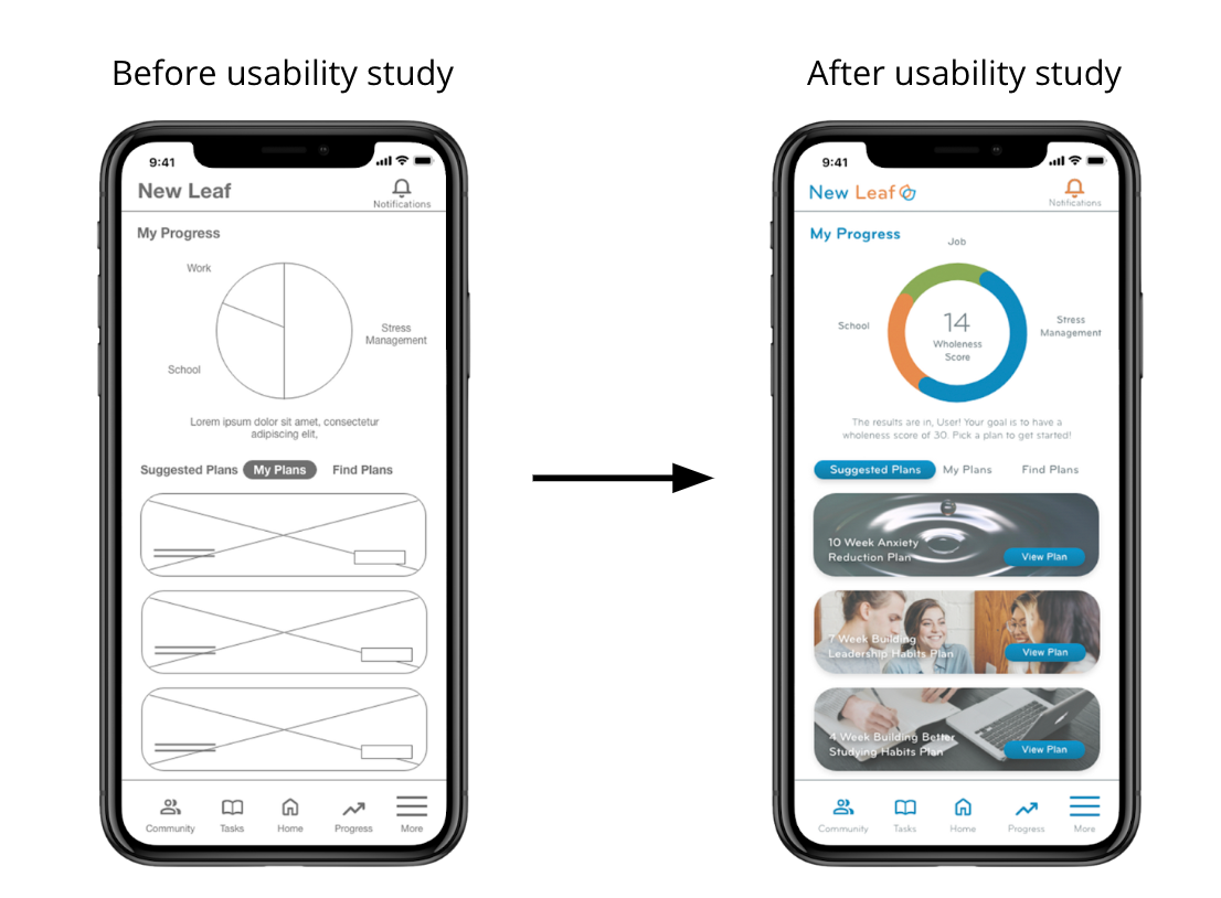
The goal for the progress page was to provide visual indicators for users. I wanted to organize this page into clear sections that would lead the user into the user flow.
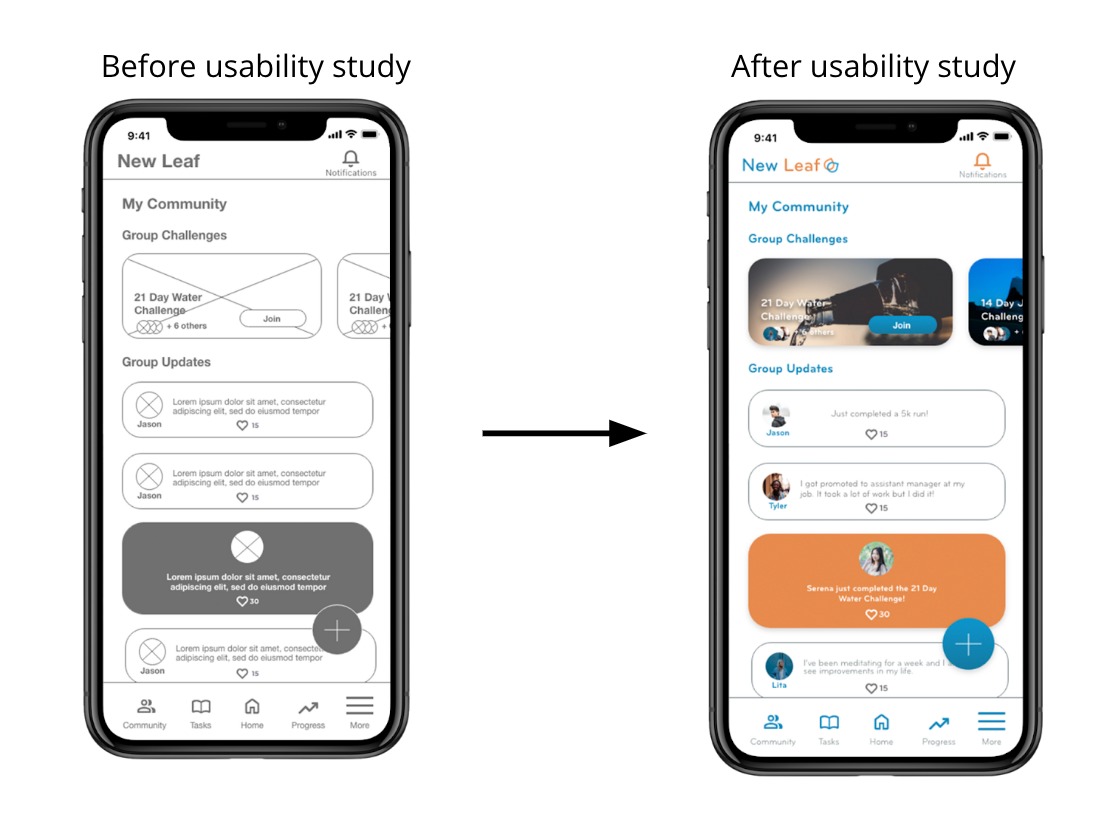
The goal for the community page was to provide encouragement and motivation because one of the personas stated that they would like to be in a positive environment. To celebrate when a task is completed, the user is highlighted in orange in the group updates section. Not much change was needed after the study.
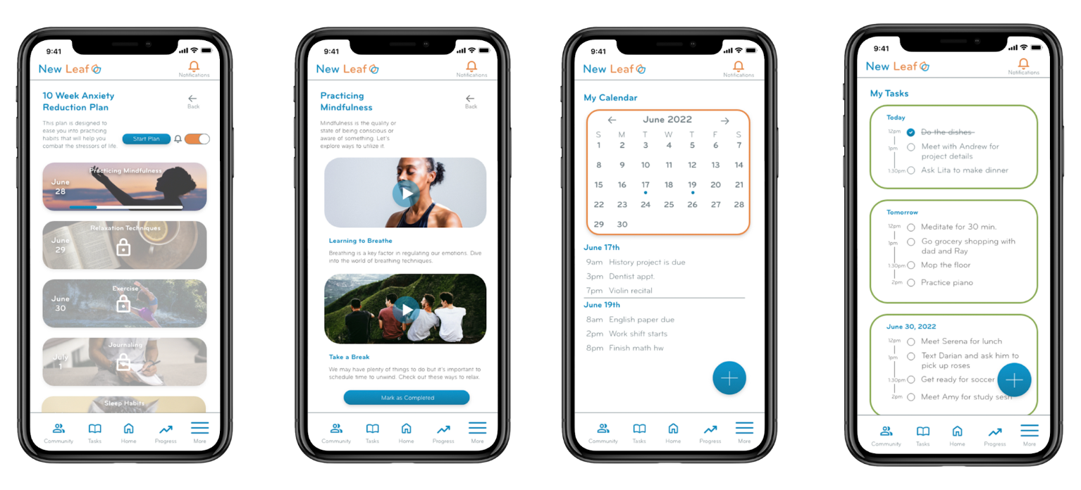
High Fidelity Prototype
Due to most users being confident when navigating the low fidelity prototype, the high fidelity prototype includes the same navigation and user flow.
Accessibility Considerations
1. All colors meet the WCAG guidelines.
2. All versions of the app have a change language setting.
3.The dedicated mobile app includes a touch haptics and night mode option. The responsive website versions have a settings and accessibility buttons located in the footer of each page.
Responsive Design
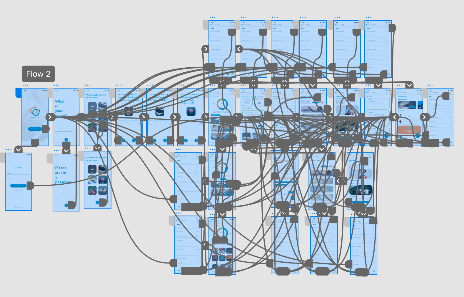
Sitemap
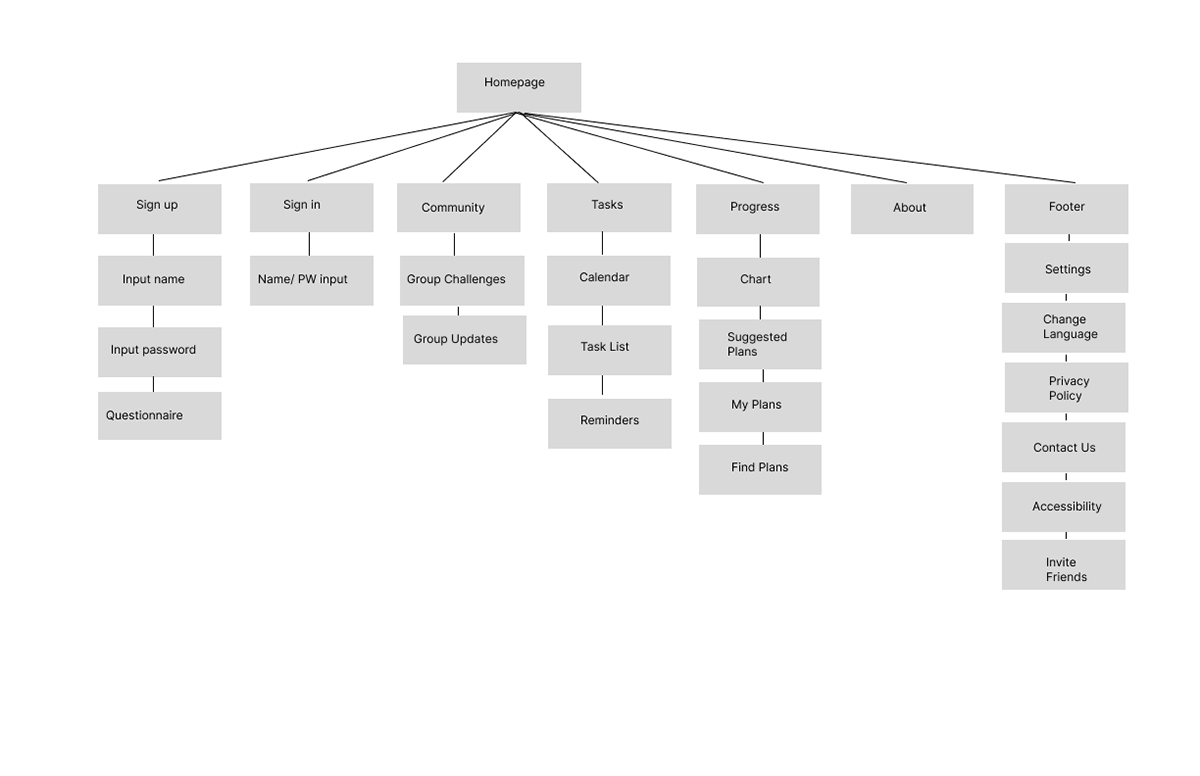
My goal was to create a navigation bar for the responsive website version of the app. I created a site map as a guide to structure the website; which in turn became the guide for the tablet and phone versions.
Responsive Designs
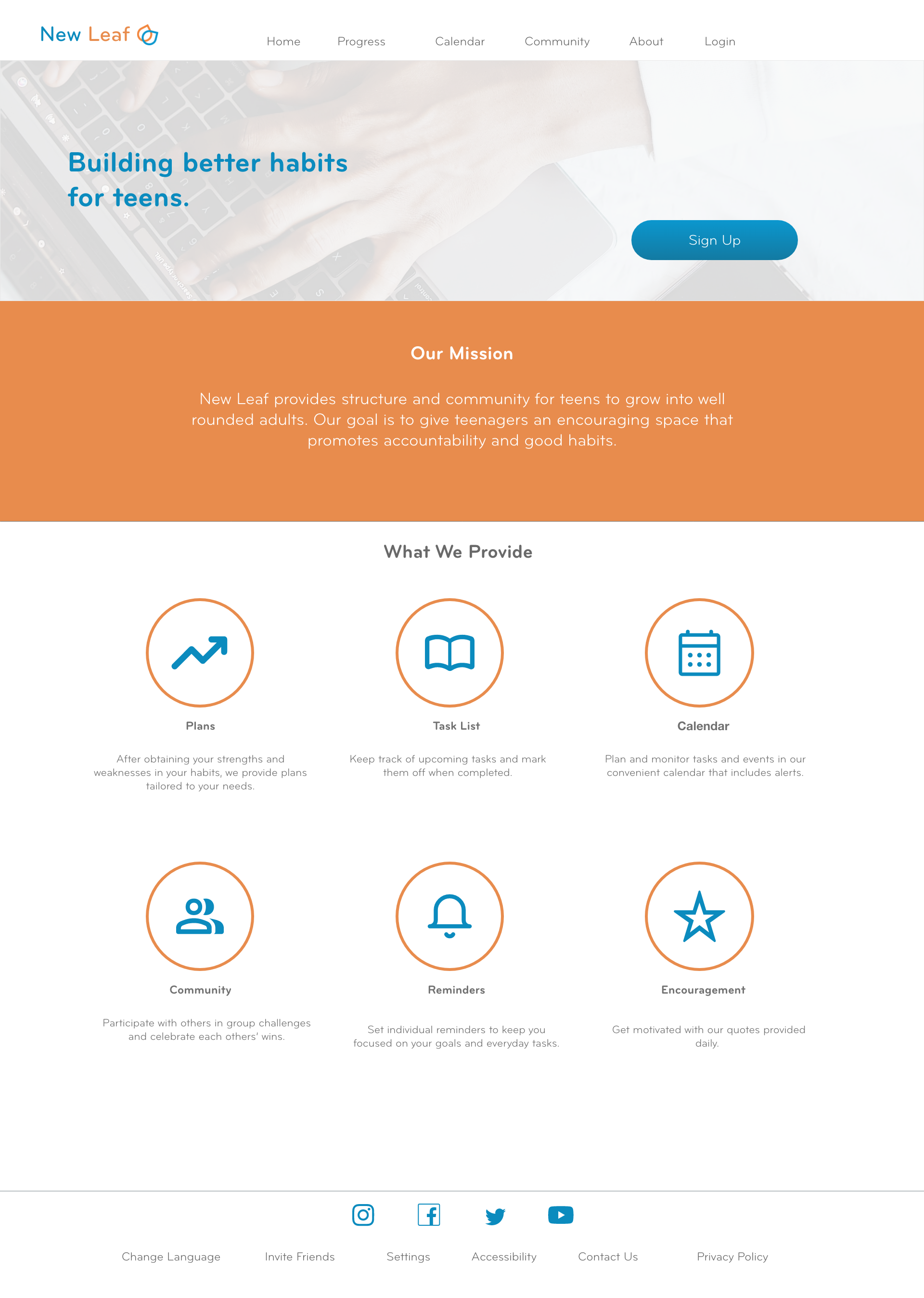
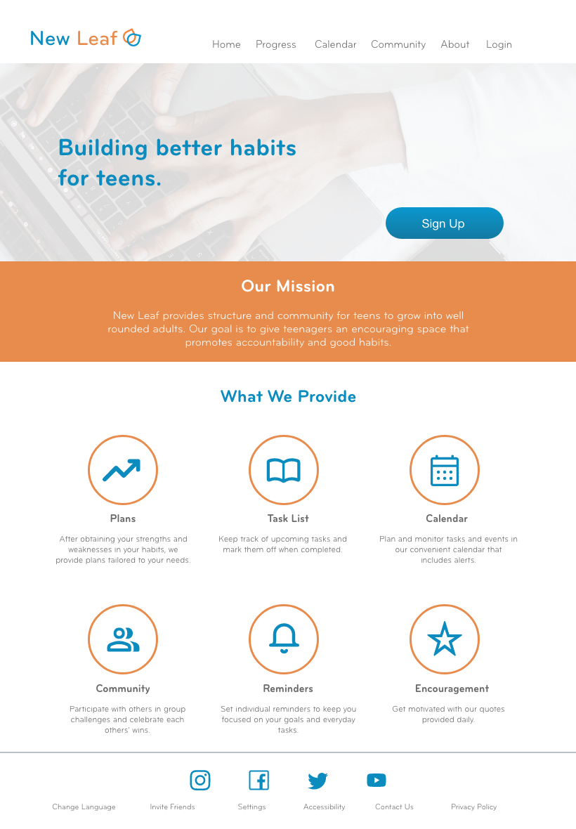
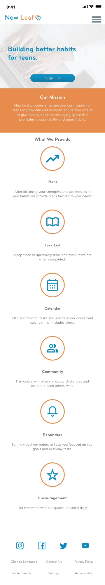
The designs for the screen variations include the desktop, tablet and mobile versions. The design was optimized to fit the user’s screen on any of these devices.
Going Forward
Takeaways
Impact
With this app, teenagers are able to connect with others, remain organized and pursue better habits that will help them in the present and future.
“This is really convenient, I don’t have to look for an accountability partner on my own anymore. I can just go to the app.” - User A
What I Learned
I learned that a designer should always reference the information architecture that was created before the prototypes. It’s okay to make changes as you go, especially if it’s more suitable for the user’s needs.
Next Steps
1. Receive more feedback from both designers and users to solidify any changes.
2. Double check all spelling and WCAG guidelines to make sure the project is ready for developers.
3. Send to developers to get the app running.
Let's Connect!
Thank you!