
The Product
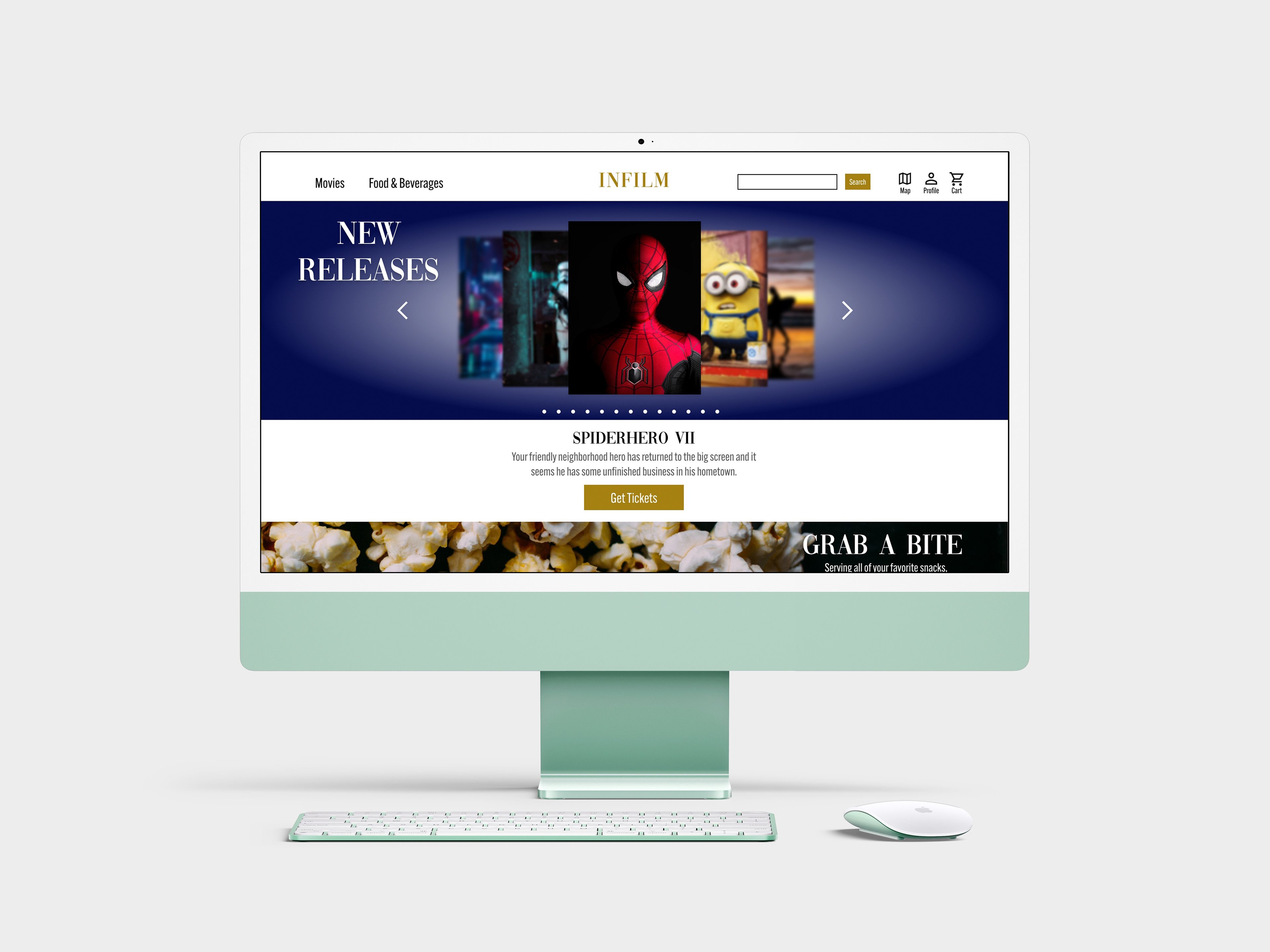
A high-end movie theater website where users can purchase tickets and food. The blue and gold color scheme was chosen for this project in order to represent the luxurious aesthetic the project aimed to represent.
The Problem
Users want the convenience of finding a movie theater near them and have a simple experience when purchasing their tickets. Users would also like their food preferences to be considered.
The Goal
Create a high- end movie theater website that allows users to purchase tickets without confusion while giving them an option to find their preferred movie theater location. The other goal is to offer users multiple food options.
My Role
Lead UX designer, Lead UX researcher and Lead UI designer
Responsibilities
User Research, Wireframing, Low Fidelity and High Fidelity Prototyping, and Accounting for Accessibility.
Understanding the User
User Research: Summary
The research that I am conducting is for a high-end movie theater website. I held in person interviews with four participants. Before the interviews were held, I predicted that most of the participants would feel the same about the user flow when completing a ticket purchase. My assumptions were correct when most participants commented on how easy it was to buy tickets. Most participants shared the same opinion about how they felt when they got to the checkout portion of the website.
User Research: Pain Points
1. Lack of Food Options
Not having the right food options takes away from the high-end experience that this website is aiming to provide.
2. Feeling Rushed
Having to race to secure your seat selection in the theater makes users feel uneasy and can potentially cause purchase errors; forcing the user to cancel their purchase.
3. Having to Leave Website
Users leaving the movie website to read reviews about the movie can cause frustration.
4. No Clear User Flow Guidance
Having too many visuals can be distracting and overwhelming. Unclear button labels will cause users to hesitate to move forward in the user flow.
Persona
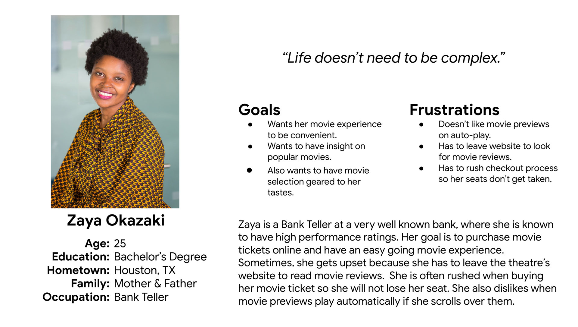
Problem Statement: Zaya is a high performing bank teller who values simplicity and needs to see reviews before she purchases a movie ticket because she wants to be sure she will enjoy the movie she picks.
User Journey Map
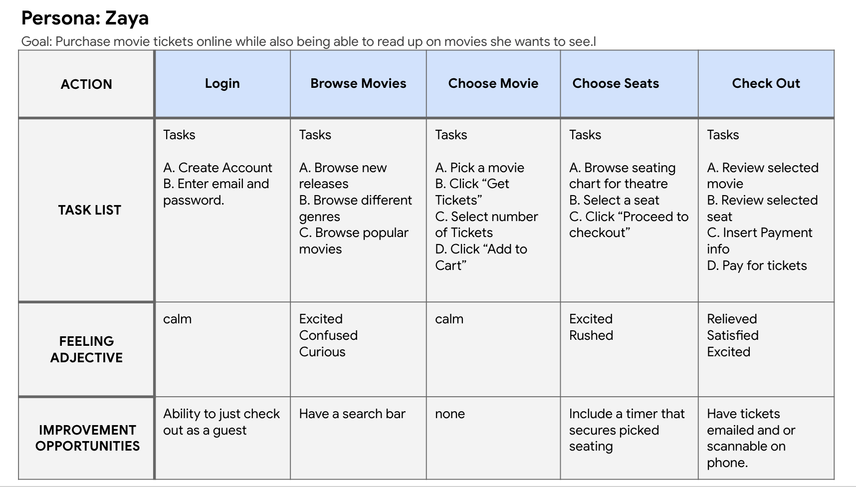
When mapping out Zaya’s user journey, it became more clear on where changes can be made on the website. It also became clear on how we can keep Zaya from feeling rushed when choosing seats.
Starting the Design
Sitemap
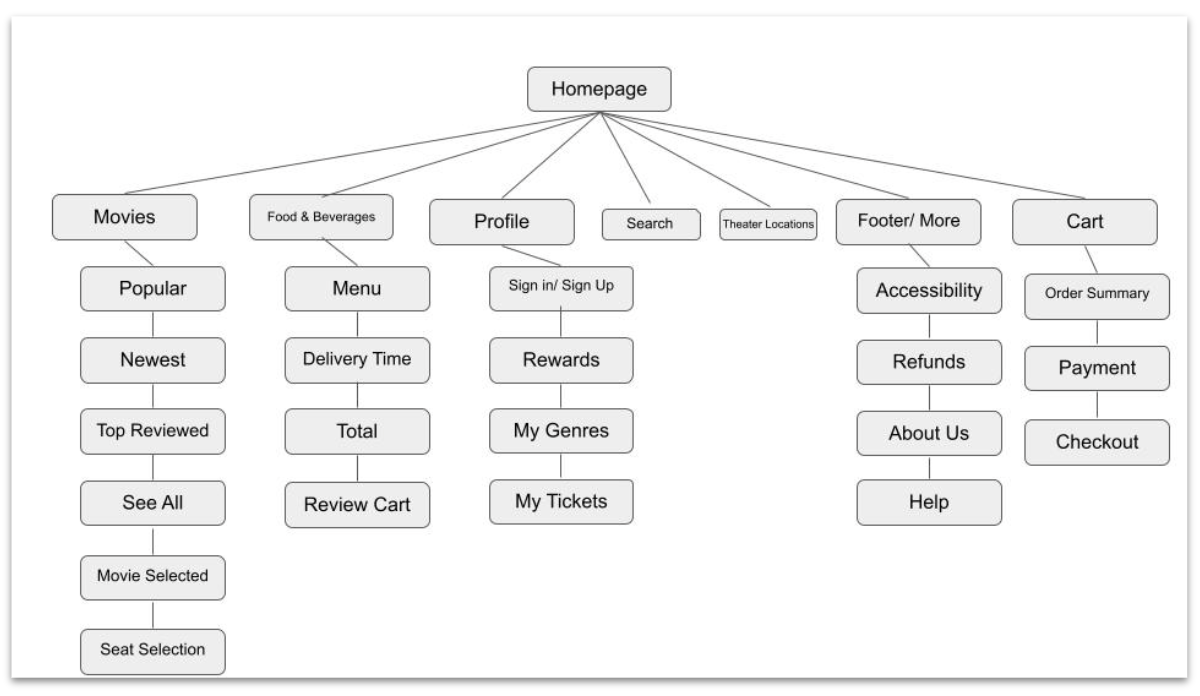
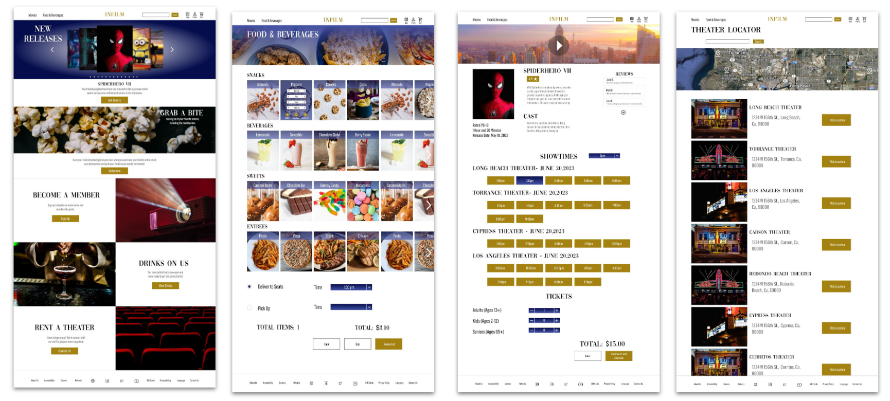
My goal was to have a navigation bar so users can always have access to different entry points within the user flow.
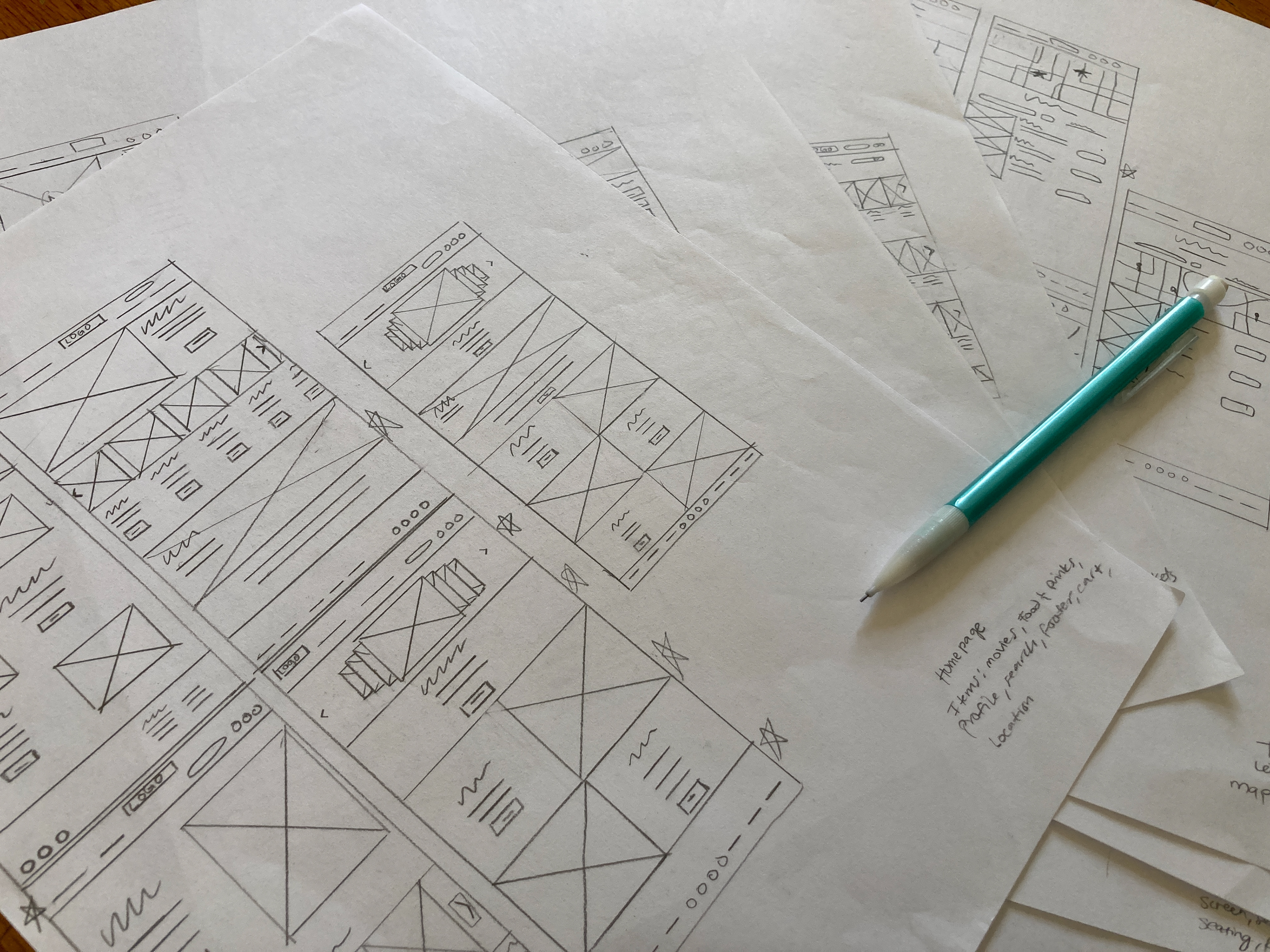
Paper Wireframes
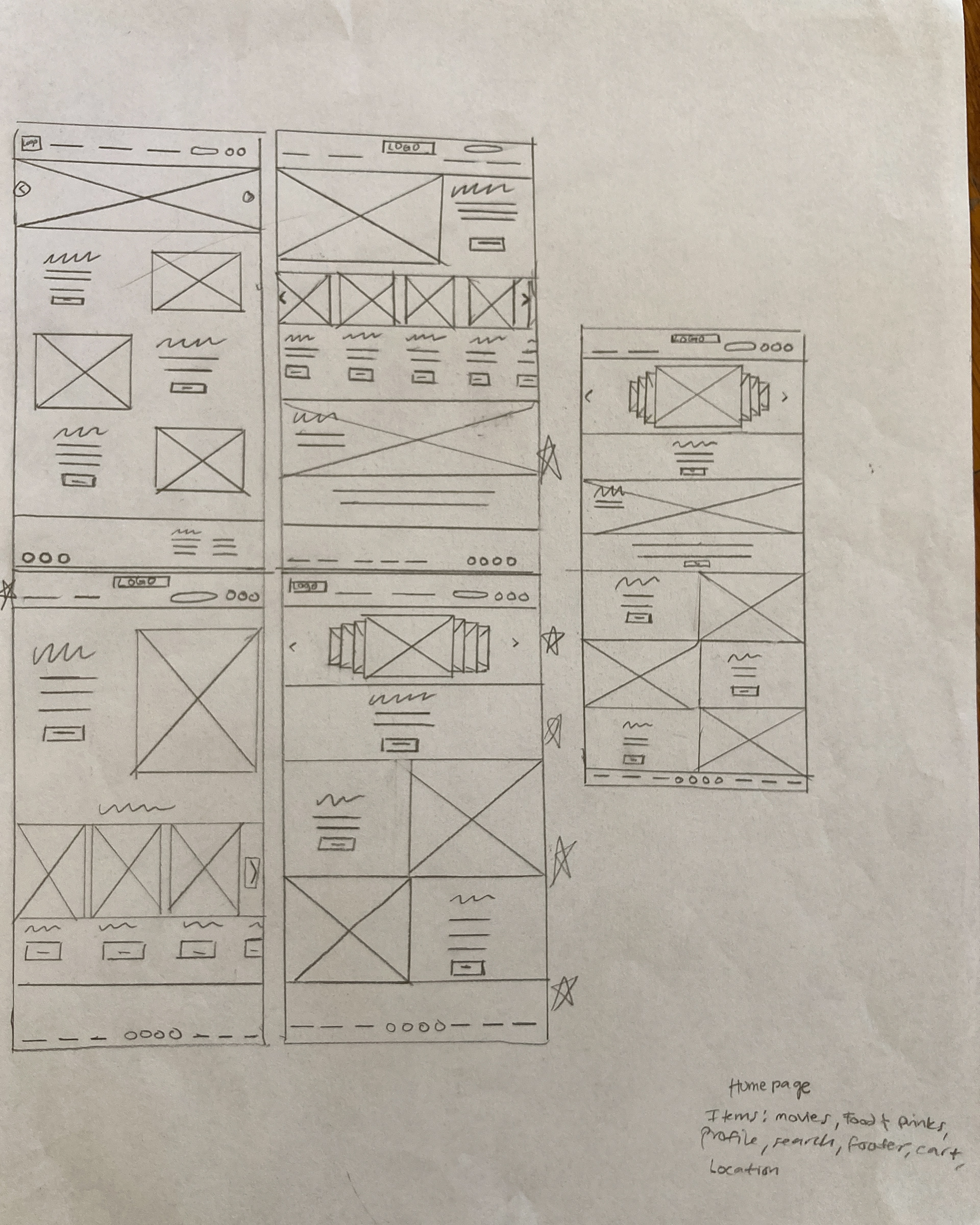
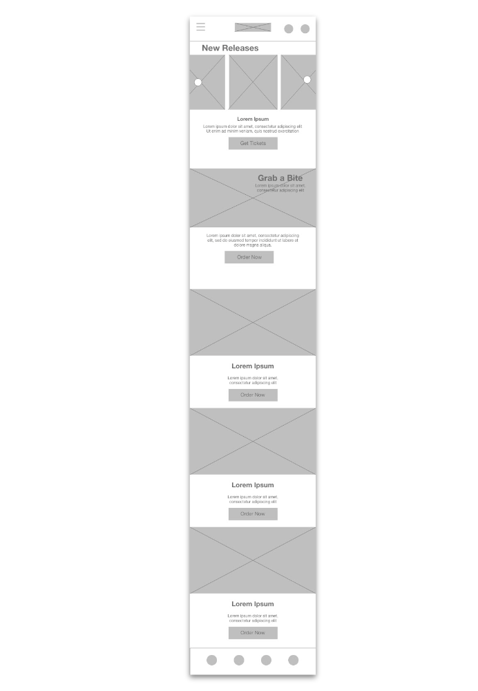
My goal for the homepage was to showcase the newest movies but not overwhelm them. I wanted to keep the layout simple and classy to maintain the high-end feel the website was aiming to represent. So, my final wireframe includes a carousel of new movies and information that goes down the page in a Z- pattern. All other wireframe pages received the same exploration.
Paper Wireframe Screen Size Variation(s)
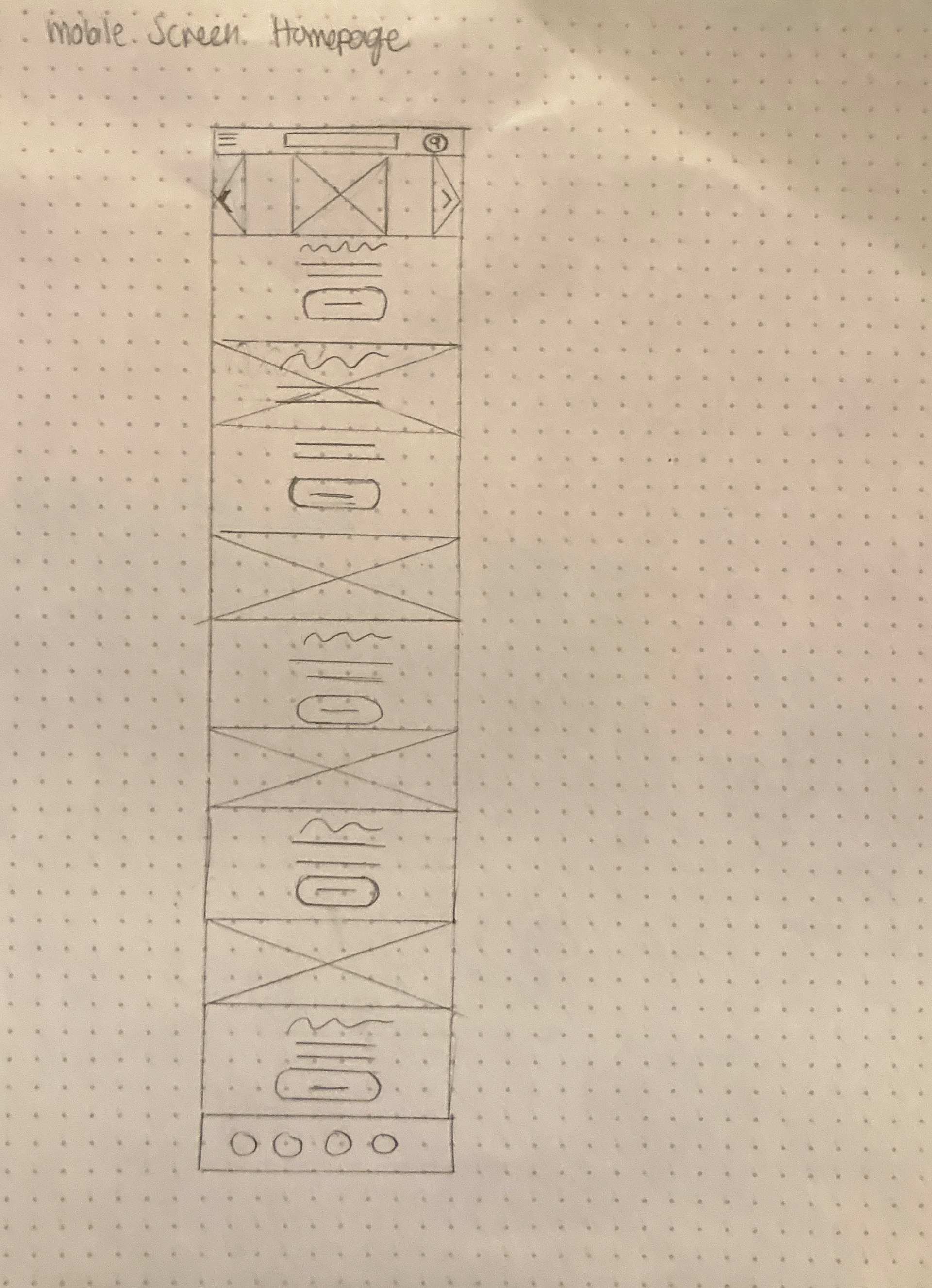
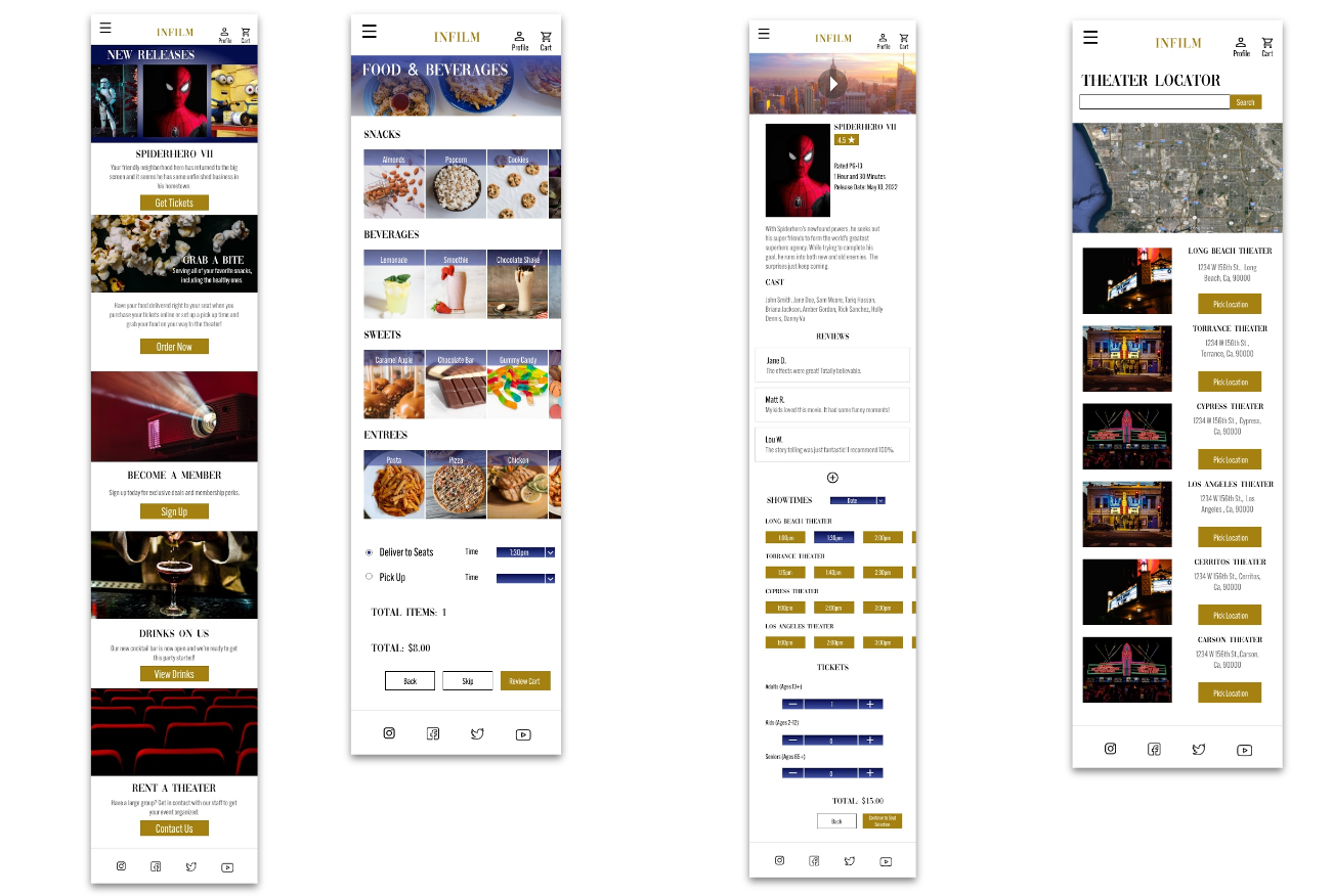
My goal was to create the mobile version of the website as similar as possible. Here, all footer information and search ability is included in the hamburger menu.
Digital Wireframes
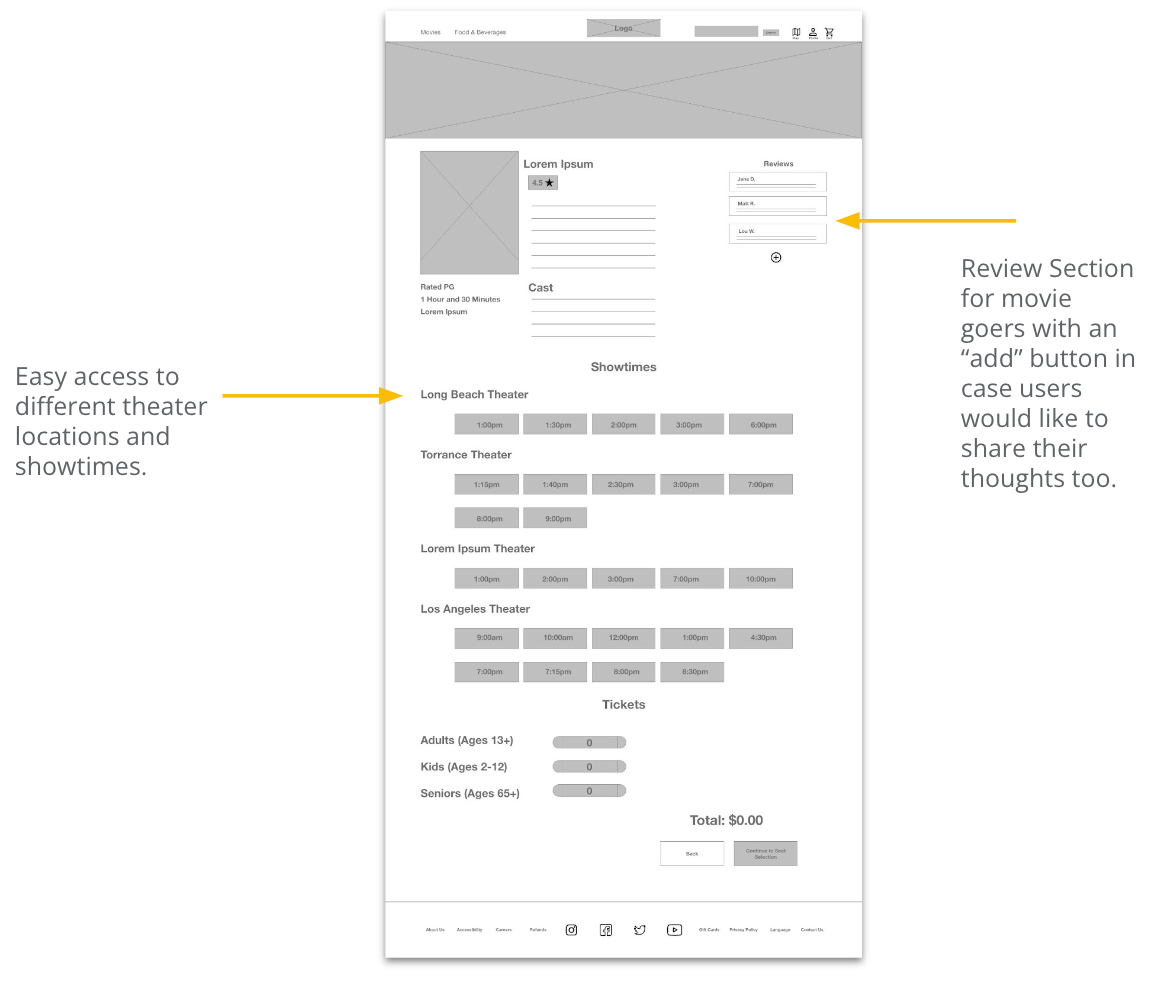
My goal for the movie selected page was to solve user pain points, which included incorporating a reviews section so users don’t have to leave the website to find out what people are saying and a showtimes section that showcases different locations that are showing the same movie.
Digital Wireframe Screen Size Variation(s)
The mobile version for the desktop homepage is presented here. The carousel has been simplified and the buttons have been made bigger and centered.
Low-Fidelity Prototype
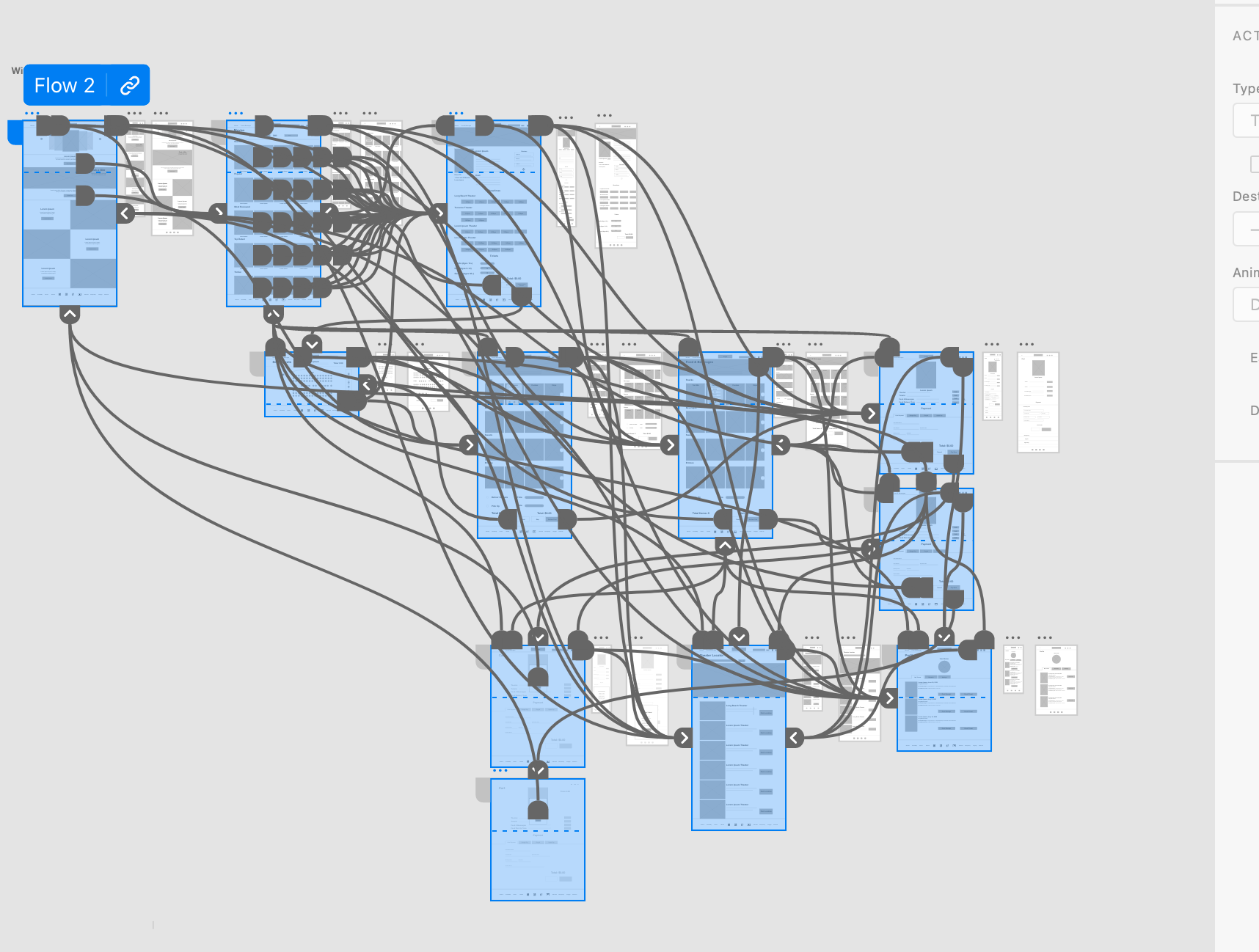
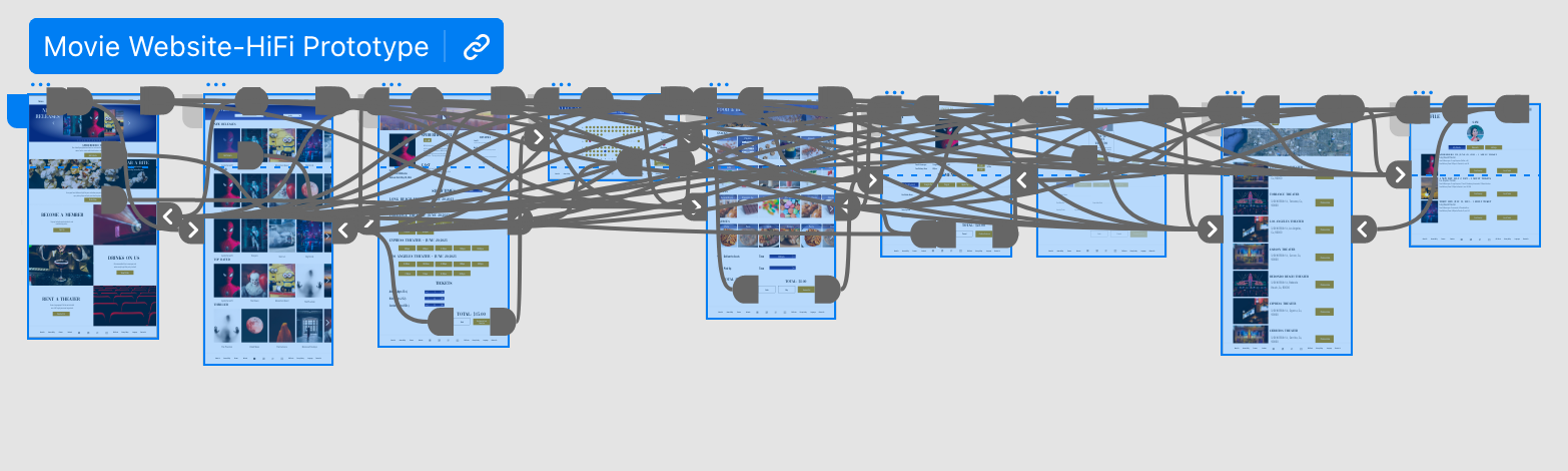
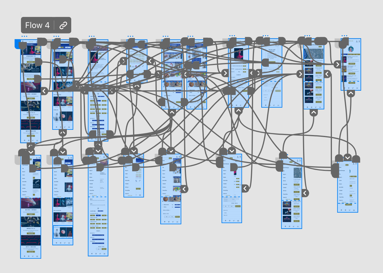
To show the user flow for the INFILM website, the wireframes have been made into a low-fidelity prototype in Adobe XD. Users can move back and forth in the user flow.
Usability Study Parameters
Study type:
Moderated usability study
Location:
United States, California
Participants:
5 participants
Length:
20-30 minutes
Usability Study: Findings
1. Users found the website easy to understand.
2. Some users found the font size and buttons too big.
3. Layout cuts off important information.
Refining the Design
Mockups
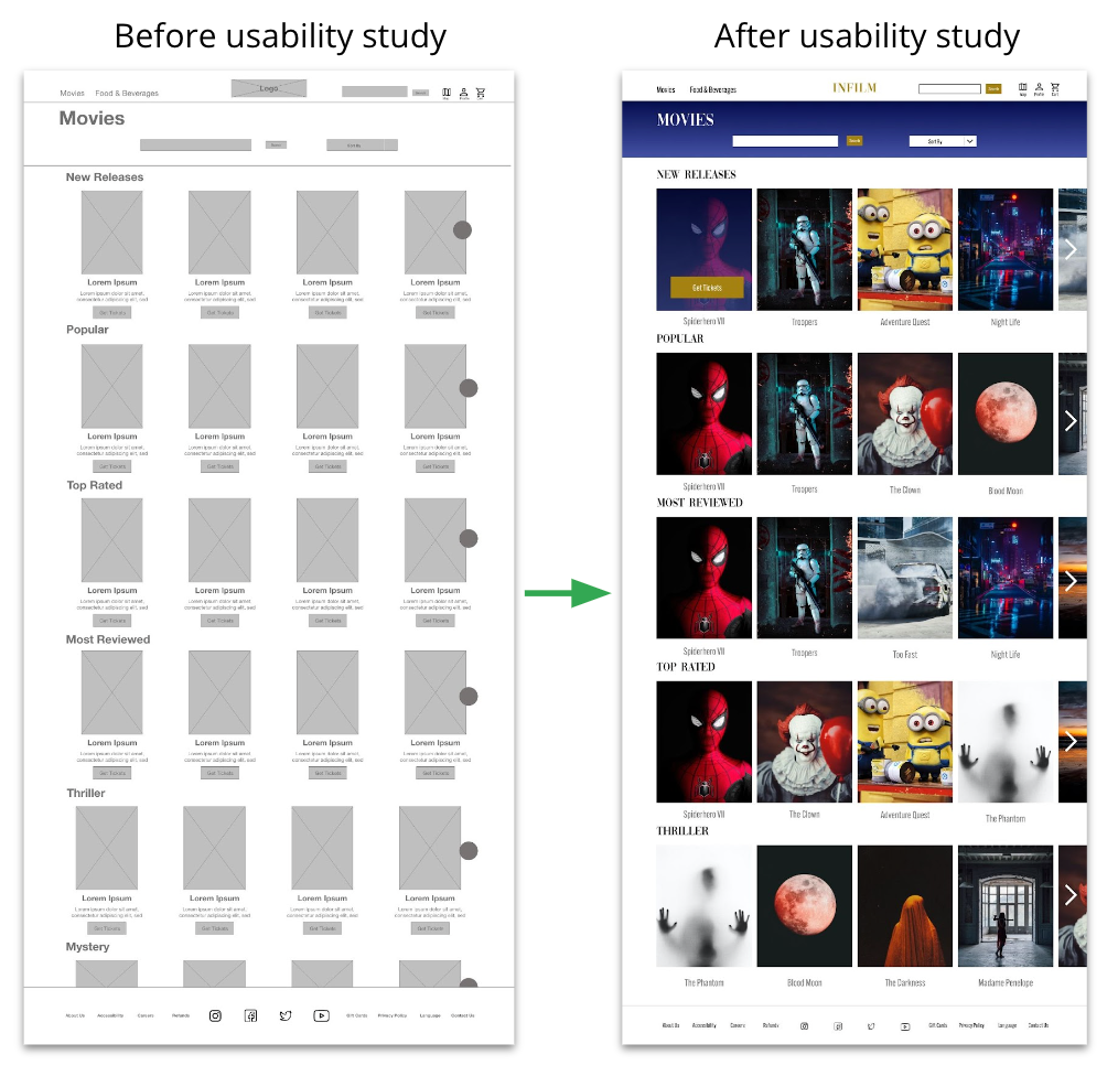
The previous design included a movie description and a button below the movie. Due to that layout, users found the page overloaded with information. To combat this, I removed the description and button. When the user hovers over the movie, they will see the “Get Tickets” button.
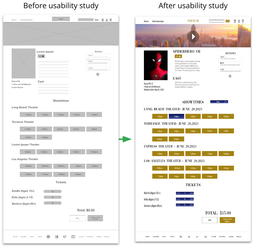
The previous design lacked a way to pick a date when selecting a movie theater. In the improved design, I added a date drop down menu next to “Showtimes”.
Mockups: Original Screen Size
Mockups: Screen Size Variations
High-Fidelity Prototype
Presented are high- fidelity for both the desktop and mobile versions of the movie website. The desktop version utilizes the navigation bar and the mobile version utilizes the hamburger menu.
Accessibility Considerations
1. At the bottom of the webpage, there is an accessibility button, as well as a language button.
2. The website’s color palette follows WCAG guidelines.
3. All text is visible and does not go below 12pts.
Takeaways
Impact
User’s found that purchasing both tickets and food through the website was simple.
“Pretty easy, nothing is confusing” - User B
What I Learned
Always remember that users expect buttons to be in certain areas based on past experiences on different websites. Psychology plays a big role in user flow.
Let's Connect!
Thank you!